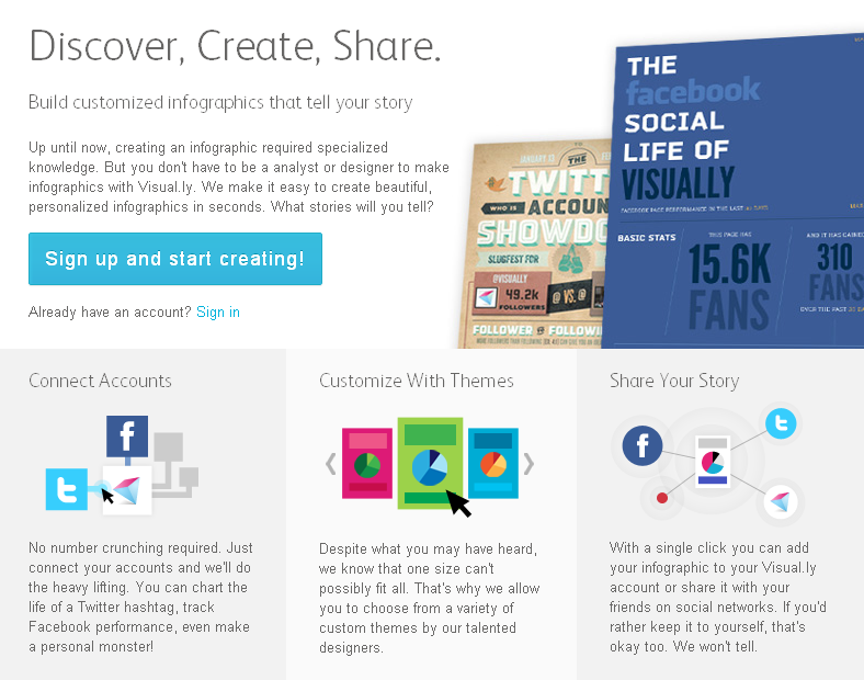
Back in July of last year I wrote about the launch of visual.ly, the gallery/community platform for showcasing data visualisation and infographic work. At the time the most intriguing footnote to this launch was the promised release of an automated, infographic creation tool which was scheduled for late 2011. There’s been a bit of a delay but today sees the launch of Visual.ly Create.
The people behind Visual.ly have tapped into their collective years of experience in developing infographic designs and attempted to integrate the best practices of data visualisation design into a step-by-step process which unleashes the visual potential of your desired data feed:
…we’ve built data feeds into a number of infographic designs, created for you by our team of expert designers. Making an infographic, based on your own data, couldn’t be easier. Simply connect and click to produce a professional-looking infographic. If you don’t like the first design you try, click though the themes until you find one that you do like.
Here’s an example of one of their launch designs to demonstrate the potential outputs of this automatic creation process. I’ve not had chance to play with the tool yet so can’t yet provide any narrative or judgments about its value or effectiveness. There is still a huge appetite for infographics across great swathes of the online population so I’m sure it will prove to be a popular development amongst that demographic. Moreover, it will be interesting to see how the tool’s capabilities evolve over time.
…this is just the beginning. Visual.ly Create will grow over time to include additional data feeds, designs, stories, and themes in the areas of sports, politics, economics, food, and more. We’ll even be opening it up to the community, so that you can create your own designs and themes. That’s when things get interesting.

