When you run a blog you are using this platform as a shop window to share your ideas, inspirations and thoughts. Eventually, after a certain amount of time and, I guess, success, you are lucky enough to establish enough of a profile that people start to invite you proactively for your opinions on subjects, without you having to encourage it!
One of the most common question I am asked these days is what sort of data visualisation I like the most.
It is clearly a very open-ended question and one that is hard to satisfactorily answer on the spot without later thinking more deeply and wishing to refine your response. Indeed, forming a pure and consistent conviction about what you like is difficult (for some) especially in such a rapidly growing and evolving field like data visualisation.
You may be currently caught up with the beauty of a flavour of the month project or have a particular persuasion towards a given designer or even a contemporary subject. You might marvel at the technical capability of a design but find yourself hypnotised by this technical competence above the resulting value of the visualisation. All these diversions can cause you to respond with a different answer to this type of question on each occasion it is asked.
I’ve been reflecting recently on what I truly consider to be my most ‘liked’ demonstrations of this art form, particularly following my recent run of data visualisation training sessions, where the question popped up on a few occasions, and also in preparing for an article I am writing for O’Reilly Radar.
“Simple visualisations that reveal rich stories”
After a long mental trawl through over five years of active participation in this field I’ve concluded, perhaps unsurprisingly, that the visualisations I love are those that exhibit a very simple design execution but unlock seemingly disproportionately rich stories. I say disproportionately rich because they aren’t complicated constructions and seem to give you more insightful return than the interpreting effort you are required to put in. Above all they respond emphatically to the ‘so what?’ challenge you can pose to design solutions.
Here are two perfect examples of what I mean:
The first example above comes from Michael Deal, a US based designer, who was commissioned by sports manufacturer Umbro to produce visualisation designs for each match during the 2010 World Cup. I profiled Michael and his design process in my first Visualisation Insights article.
What I love about this approach is the fact you can unlock such a detailed story from this small, dense and straightforward display. Plotted over the duration of a match, the green lines are the passes made by each team, the blue triangles are the shots on goal and the red dots are goals scored. This reveals so much about the possession and position of each team, the ebb and flow of attacks, the penetration of attacking play, the effectiveness of defensive tactics, the opportunism of some who score with few shots, the profligacy of others. Regardless of your liking of the sport, whether you recall or even care about the matches themselves, you cannot fail to see the story unfold in these little gems.
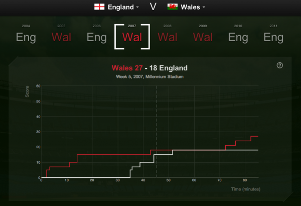
In this next piece produced for Thomson Sport, the display is even simpler, with just two lines plotting the incremental points tally for the opposing Rugby Union teams across an array of Six Nations encounters, but what you get is a fascinating path of how leads were built, deficits were reduced, the periods of deadlock, the swing of potential victory from one side to the other, the moments when a lead becomes unassailable. Maybe it is the unique scoring of Rugby which lends itself to such analysis but, as with the example above you, see a rich story emerge from the simplest of encodings and with so very little effort on your part as the reader.
There are many other examples I could have used, but these two stand out for me as super demonstrations of how data visualisation can unlock patterns in data that would otherwise remain unseen. Furthermore, as I have mentioned before, there is something incredibly elegant about a visualisations that successfully portrays a story in static form.
So what about you?
I’ve shown you my hand, so let’s see what you’ve got!
Take a step back from the relentless stream of great new works, what are the examples of data visualisation you truly think reflect the practice at its finest? What type of designs do you most consistently ‘like’?
Stick a comment in the box below, share links to your examples and explain why the choice you have made strikes such a chord with you…


