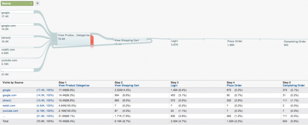
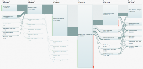
Yesterday, at the Web 2.0 Summit, Susan Wojcicki & Phil Mui unveiled the release of “Flow Visualization” in Google Analytics, which helps web site owners and analysts to enhance their understanding of visitor path and goal analysis – how visitors flow through your site’s pages and how this maps on to your intended goals.

Many observers have compared this approach to the famous Charles Joseph Minard 1869 depiction of Napoleon’s march on Moscow – and I can see where they are coming from – but I instinctively thought these more strongly resembled Sankey diagrams when I saw them first.

Another point, are we seeing the influence of Martin Wattenberg and Fernanda Viegas here, in their roles as co-leaders of Google’s “Big Picture” data visualization group? Especially if you recall the strong emphasis of flow in their respective/joint visualisation portfolios.
The visitor and goal flow visualisation features will be rolling out to all Google Analytics accounts this week. Intriguingly, it sounds like further visualisation devices will be coming to Google Analytics in the near future.
