Last month I shared details of the WordPress 2011 ‘State of the Word’ – founder Matt Mullenweg’s annual overview of the headlines, facts and figures relating to the utilisation of the opensource web/blog tool.
I also shared news that data from the first ever WordPress user and developer survey was being made available and designers were being invited to dig around the 18,000+ records and come up with some insightful visualisation work.
I was therefore delighted to hear from reader Graham van de Ruiz, a designer from Zimbabwe, who got in touch to share a fascinating attempt to visualise this significant pot of data.
(You can also download a 7.5MB pdf version)
I invited Graham to take part in a brief interview in order to find out more about the design process he followed and the visualisation piece he arrived at.
When you saw the blog post sharing the data, and inviting designs, what was your motivation for taking on this challenge?
Data visualisation is a recent interest of mine; my background is more in editorial design. I’ve been teaching myself a few scripting languages after I started with ActionScript last year, and I was looking for a trial project that would help me test and expand these skills through some data visualisation. I learn best when I have a real project to work on, and so I was looking for some data I could play with. The large amount of data meant that I had to write proper code—there was no way I could fudge this one—and the complexity of the data (the survey didn’t follow a straight path) provided an attractive challenge. I also thought that I could get good exposure and feedback through visualisingdata.com if my project was successful.
There is a lot of data in this survey, how did you arrive at a decision to focus on the data covered by your design?
That took a while. From the first question respondents get re-routed based on their answers, and so there are only two questions that all respondents are asked: the first one about how they use WordPress and the last one about whether or not they earn a living from WordPress. I thought this last one was interesting, and I wondered how much more we could find out about those who do make a living from WordPress, and those who don’t. Are there any trends that might be revealled by a visualisation? So these questions were my starting point, and I included a few others based on how relevant I thought they were, how easily and effectively they could be included in the graphic, and how many people responded to them or would be excluded. I didn’t want to leave out a whole lot of data by looking at a question that most respondents didn’t answer, or weren’t even asked.
How did you approach the design of your visualisation? Did you take any inspiration from other designs/designers out there?
I started by just trying to get the scripting working and get something basic on the page. Once I could see it was working I adjusted the parameters for the sizes of dots and started playing with the colours. It was important for me that the colours have transparency and blend in such a way that one can see overlap and build-up, so that’s the first aspect of visual design I tackled. Coming from a print design background, it’s still most natural for me to work on a static page of standard print dimensions, and my main interest with scripting at this stage is to use it for design for print. I’m sure I’ll venture into interactive design pretty soon.
I’ve been looking at examples of data visualisation all over (this site included), so I suppose I’ve got inspiration from a lot of places, though not specifically for this piece. I wanted to keep it original, and so I didn’t conciously base it on anything I had seen.
Can you share some of your early sketches/ideas as you familiarised yourself with the data and its ‘shape’? What other approaches did you consider (but ultimately reject)?
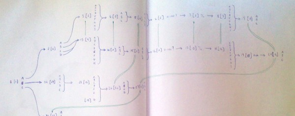
The first thing I had to do was to work out the survey structure, since it branched multiple times. I quickly sketched it out on paper and used lines of different colour to link questions that were the same or similar but on different paths.


I found it much easier to understand when I could see it mapped out like this, and I could see where I might be able to make connections and link the responses.
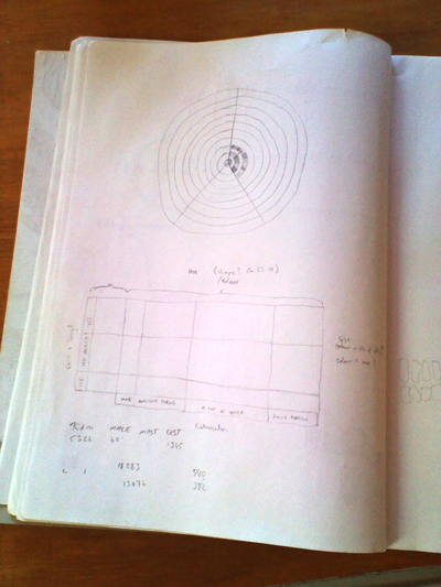
Initially I wanted to create a sort of flow map that one could use to trace the path of each respondent (or rather, each group of respondents) through all the questions, with line thickness showing numbers of respondents. I did some trial pencil sketches and it looked good for two or three questions, but then suddenly became way too complex. I tried this approach in a few different shapes, just in rough pencil sketches. I realised I had to narrow the focus. Then I saw a circular scatter-graph online somewhere (I can’t remember where) and suddenly it seemed to fall into place. With a scatter graph I could use the two axes, and grouping on the axes, as well as size and colour, and maybe even shape, and trends would appear through the grouping of dots and colour build up.
What software/technical resources did you use to develop the work?
I used Microsoft Excel for looking at the data initially, just to see the form of the questions and answers. As the answers all came in as full text strings, it was difficult to see any patterns or trends. I used Notepad++ to do some find/replace and changed all the answers to A, B, C etc. In this form it was much easier to skim over and it helped enormously in working out the structure of the survey. I could see pretty quickly, for example, that those who answered C for the first question only answered one other question: the last one. Replacing the strings with single characters like this also greatly reduced the size of the file, from 9MB to 800KB. For design and scripting I used Adobe Illustrator with the free Scriptographer plugin. It’s vector drawing software, not really made for data analysis, but I like the challenge of building the visualisation from scratch like this. It means I understand every step of the process and am not working with a limited set of pre-built templates. Scriptographer (and soon Paper.js) is the scripting environment I’m most excited about learning right now, so it made sense to see what I could do with that. I certainly intend to look at other software down the line, though.
How did you decide on the visual properties of the design (eg. the colour scheme, the dimensions, the typeface etc.)
I wasn’t really sure what shape it would take, so I just started with A3 landscape so that I could print it out easily for myself and that I hoped would be large enough to accommodate everything. I was ready to change it if I felt I needed to, but I never did. I wanted the focus to be strongly on the graph, not the labels and other information, so I started with the circles and fiddled until I got something I was happy with, and then used greys and a grey-blue for the rest of the design. The typeface, Azuro, is one I purchased recently and have been eager to test on a project like this. I think the large x-height, narrow character widths and open forms are well suited to information design.
How did you know when to stop iterating the design?
I stopped when it matched the idea I had started with. I think there are ways I could change it and other ideas I might like to try, but it seemed to me that this concept had come to its conclusion. I felt I had learned what I had hoped to and had seen my idea through. Since I did this mainly as a learning exercise, I felt I would rather start something new than spend more time trying alternatives.
What insights are you hoping for people will draw from this work? Any plans to take this project further? Any follow ups?
I was really just hoping to be able to reveal anything about the data to show how effective visualising it can be when looking for patterns or trends. I focussed on those few questions because I hoped we might be able to learn something about who is earning money from WordPress and how they use it, and although what we see is hardly surprising, I find it enormously satisfying to be able to see it so easily with the visualisation. I had a few ideas for simple variations, such as using one circle in place of each block of dots, but I felt I had succeeded in my initial aims and would rather start on something new than keep iterating with the same concept.


