I’d just got comfortable and in place to watch the Sunday afternoon football on Sky Sports, looking forward to having a bit of mental breathing space from all things data visualisation, when up pops these two graphics…


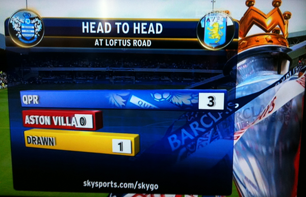
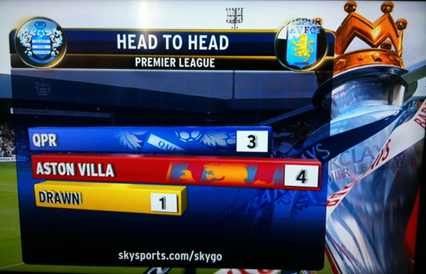
The first graph compares results of QPR vs Aston Villa matches at Loftus Road (QPR’s home ground) and the second shows head-to-head results since the Premier League began in 1992.
Not only do we have terrible 3D bar charts employed but in the first graphic we see a significant bar attributed to a zero value, with the added mistake of the value label clashing with the ‘Aston Villa’ label.
This visual distortion is then amplified on the second with the ‘Drawn’ value of 1 visibly being more than half as long as the ‘Aston Villa’ value of 4.
The designer has clearly decided to combine the category label graphic with the value bars, which confusingly shifts the implied zero axis position to the right of the last digit of the longest label. Whether this has been done to intentionally mislead or is just a case of a bored designer of TV visuals looking to spice up his work, this approach ultimately deceives the receiver.
(Incidentally “Never deceiving the receiver” is one of the central tenets covered in my upcoming Introduction to Data Visualisation training…)
