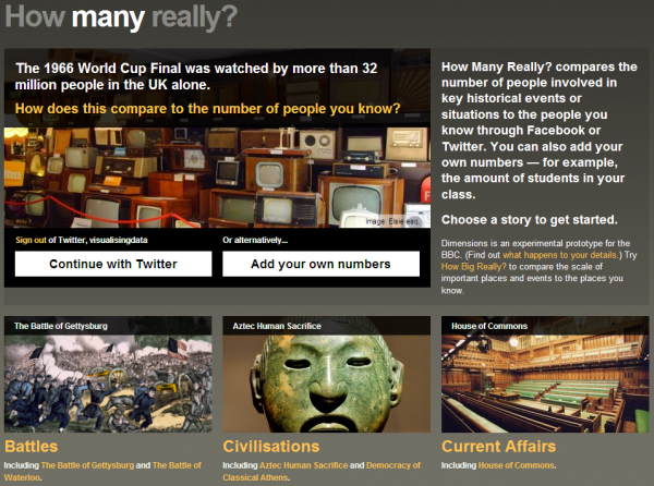
You may recall about a year ago a new concept was launched for the BBC by design consultancy Berg in collaboration with Max Gadney. This project was called BBC Dimensions and aimed to explore new ways of using digital media to relate stories and facts from history and current affairs. Today, Berg announced details of the release of a new project called How Many Really which allows users to “compare the numbers of people who experienced an event with a number you can relate to“.
The first project to emerge from this work was How Big Really which juxtaposed the shapes of important “places, events and things” onto a user selected map in order to appreciate context. This helped you get a better sense for the true impact of news and events that were sometimes difficult to relate to in terms of their magnitude. This project proved to be extremely popular with a high volume of visitors and a spot at the MoMA Talk To Me exhibition.
How Many Really takes a similar concept, sprinkles a whole new layer of functionality and applies visualisation and visual thinking solutions to complicated or hard-to-grasp numerical contexts rather than geographical/size comparisons.
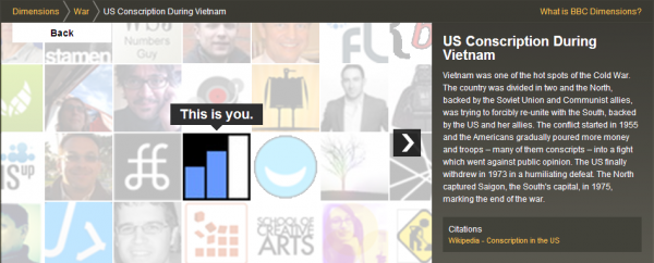
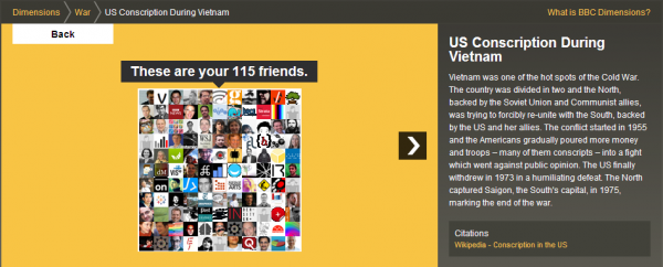
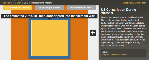
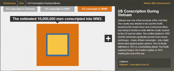
There are a number of different situations for you to navigate through and several ways to visually explore the numerical comparisons: either by linking up to your Twitter or Facebook accounts to use the quantities of your friends/followers or by typing in your own values. The process then takes you through a series of slides that starts off with the smallest level of quantifiable detail (ie. you) and walks you through different layers of contextual sizes, typically represented by the areas of larger squares, within the subject area chosen.
Here is one I did using my Twitter account friends to contextualise the US conscription during the Vietnam and World Wars:

