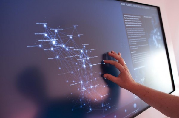
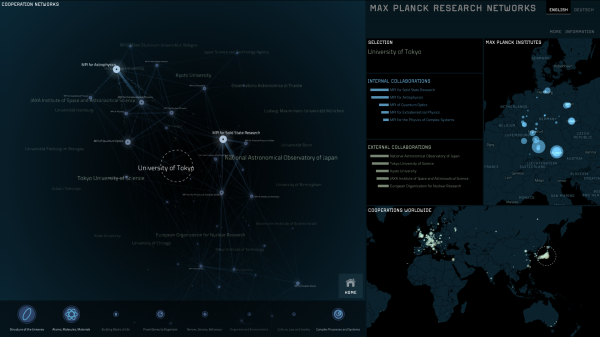
The latest fabulous project from the Moritz Stefaner visualisation factory came off the production line yesterday. In collaboration with Christopher Warnow, and other partners, the Max Planck Research Networks multi-touch installation represents the nature of connectivity across Max Planck Institutes and with international partners. It is now on display at the Max Planck Science Gallery in Berlin.
As described on the project’s site, the data came from the analysis of over 10 years and 94,000 publications from SciVerse Scopus. The visualisation brings to life a map of the Max Planck Institutes and how they are connected through scientific publications within and between each institute.
The extra layer of interactivity brought about by the multi-touch environment allows users to pan around the maps to select specific institutes and highlights their most important collaboration partners within the network and across the globe with international partners. The interactivity and transition between views looks so smooth, I also love the subtle circular ‘fingerprint’ created by the multi-touch contact. A further wonderful feature is the use of “streams of energy particles” to conceptually represent flow of ideas being exchanged between institutions.
You can read more about the project on the dedicated Max Planck Research Networks site, on Moritz’s blog and also on Christopher’s portfolio pages.


