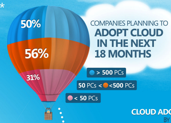
I feel compelled to share and briefly discuss this, even though it is getting plenty of column inches already via Twitter/blogs. It is an infographic published on visual.ly and produced for Microsoft to promote their cloud computing in the Asia Pacific.
The accompanying description suggests…
Microsoft wanted to create a visual statistic on how people think about Cloud Computing in Asia Pacific. We created infographic with a flow and simplified the data to make it easy to understand.
I’m having a very strange experience with this particular graphic. Rarely has one piece of visualisation or infographic design ever broken so many established practices, principles and rules of effective communication. Take a look at the balloon element below. Case closed. It is essentially impenetrable on an interpretation level – it clearly does NOT make it easy to understand.
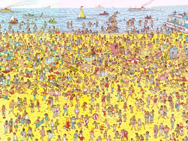
And yet I have probably spent more time staring at it and studying it than most pieces I’ve seen for a long time. Its proving to be a challenge similar in nature to Where’s Wally, I know there is something there that will inform me, but I just can’t seem to find a way of getting there.
So, to answer my rather sensationalist opening question, is it so bad that at some point it starts to become good?
As with any piece of visualisation/graphic work, it depends entirely on the objective. I can’t tell you much about Microsoft’s progress in the Asia Pacific or the attitudes of people in that region towards cloud computing, but the basic concept and connection of Microsoft to cloud computing is now firmly implanted in my mind, much more so than before, because I’ve spent so damn long looking at it. If the objective had been around inherent advertisement the graphic it probably has been good at achieving what it set out.
However, if we refer back to the text that came with the piece, the objective implied from this description is that the graphic represents a visual statistic with data that is simplified to make it easy to understand. In that sense it completely and utterly fails on every level.
Anyway, here’s a challenge, which can you complete first – useful insights from the Microsoft graphic or find Wally in the image below? On your marks, get set, go…


