One of the key indicators that demonstrates the growth in popularity of data visualisation is the increasing frequency of visualisation contests. I’m delighted to share with you details of the latest competition, a team effort between Postgrad.com and David McCandless where one lucky winner will take home a brand spanking new iPad2!
They have kindly invited me to join an esteemed judging panel to pick the best visualisation relating to a topical issue about the population of black students attending elite UK universities.
Background
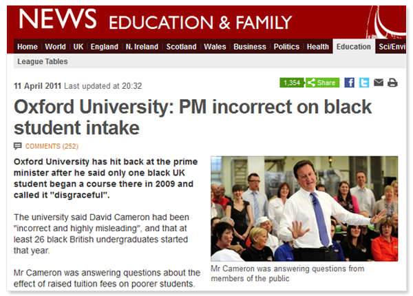
Back in April, Prime Minister David Cameron and Oxford University were involved in a public spat about the issue of how many black students attended the University. The PM said there was only 1 black student, Oxford described this was inaccurate and misleading and in fact there were 26.
This debate provided sufficient motivation for prominent data journalist and information designer David McCandless to pursue the data that would get to the bottom of the issue. However, having collated much of the data he ran out of time to complete a visualisation design and instead decided to share the dataset and open up the chance for visualisers out there to have a go…
The visualisation brief
We are challenging designers and analysts to explore this subject matter, identify your version of the truth and present this in an effective visualisation. Go through the data provided and any dig out any further useful resources you can find to create a compelling, engaging and informative visualisation which communicates the true experiences of black students applying for and attending the UK’s elite university system.
There are no restrictions on the nature of the visualisation, it can be a simple static, interactive or a full blown infographic – just choose whatever creative output provides the best platform for your capabilities to present the story you have to tell.
Whether you are fresh to visualisation or already well-established, this competition represents a level playing field and anyone can win. For information on the judging panel click here and scroll down about half way – I’m the suave looking chap at the top with the head shot I had done for the local barbers.
The dataset
The data David collected can be access by this Google Spreadsheet and is accompanied with other data sources listed in the file as well as those listed below, covering University student and applications, giving you the opportunity to combine and contextualise the topic and maximise the potential of your communicated design.
Guardian DataBlog post on Oxbridge Elitism
UCAS Annual Datasets
You are free to utilise any other dataset you discover provided the sources are publicly available and appropriate citations are included in your entry.
Why should you enter?
Here are a few good reasons why you should enter this competition:
- You’ll receive recognition from a panel of experts in journalism, data visualisation and design
- Your name and work will be promoted across the web
- You’ll have a full interview about your design process published in an article on visualisingdata.com
- You’ll have a noteworthy addition to your portfolio, website or CV
- The top three winners will receive a signed copy of ‘Information is Beautiful‘ by David McCandless
- …and the overall winner will be awarded a brand new iPad2
Admin, timelines, rules etc.
To enter the competition, simply email your visualisation as a jpeg attachment or a link to a post or site elsewhere to mark.johnstone@postgradsolutions.com and include your full name and the best email address to reach you on.
The competition is open now and closes at 11pm GMT on Monday 20th June 2011. Winners will be announced by Monday 4th July 2011. The competition rules are posted here.
Good luck to everyone!


