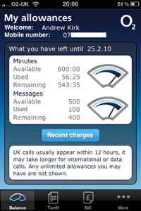
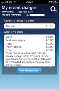
A few weeks ago I posted some screenshots from the O2 ‘My Account’ app for the iPhone. I suggested that the design could be much improved in order to increase the efficiency in the use of space and also make better use of the opportunity to provide valuable account analysis.
At the time I promised to publish a suggested reworking of this design within a few days, however, software problems and other commitments have delayed me. In this first part of two posts I will assess in greater detail the problems I perceive with the original designs. The second part, in a few days time (honestly), will publish the redesign ideas I’ve come up with.
Current design and content


If we look at the existing design, which is spread across 2 screens, these are the items of data presented:
Header
- Name
- Mobile number
- Date of next bill period
Screen 1
- Minutes available
- Minutes used
- Minutes remaining
- Messages available
- Messages used
- Messages remaining
Screen 2
- Total recent charges
- Voice charges
- Text message charges
- Data charges
- International charges
- Other charges
Assessing the current design
The major flaw in the current design is the low ratio of data to available screen space and the fact you have to navigate to a second screen to view further useful items. There are four elements that cause this reduced data density: the headers, the gauges, the navigation button and the footnote text.
- The header information below the title is a waste of time, needlessly reminding the user of their name and mobile number. I’m fairly sure most people will be aware of their name and also won’t need reminding of their mobile number. This data may occupy only 6% of the screen but nevertheless this is wasted space.
- The gauges are utterly unnecessary gimmicks that provide the user with absolutely no added insight to their usage figures. All they do is waste 10% of the screen space and repeat, ineffectively, the data already presented numerically.
- The ‘Recent charges’ navigation button is needed because there is no space available to present the data shown on the recent charges/second screen. If the other design flaws listed here were absent the second screen would not be required and neither would this navigation button. Currently, the button and the unused space flanking it occupies over 8% of space.
- The footnote text may be necessarily included from a legal perspective but does it really need to be presented on the main screen especially given that it takes up a massive 17% of the space? You’d think it could be hidden away on a secondary page, navigable via a button or link of its own and with a footnote indicator next to the figures presented.
You could also make a case for the minutes/texts ‘available’ figures to be considered unnecessary given the remaining and used values combine to this total and the user is probably well aware of their contract allowances.
The conclusion is that 41% of the design ‘real estate’ provided by a single screen is being wasted. So what is the solution?
I’ll come back to you with my attempt in a few days…

