The waiting room
A few weeks ago I was sat in a doctor’s waiting room area trying to kill time before an appointment. Normally, my iPhone would come to my rescue as I try to zone out from the noise of people coughing and sneezing around me but on this occasion I’d left it at home. I was therefore left with nothing to do except gaze around the room and take in my surroundings, which revealed one of the most densely packed examples of information overload I’ve seen for a long time.
Adorning almost every spare inch of space on the main wall were hundreds of posters and fliers with health information, advice, adverts and announcements covering the full spectrum of medical topics. They weren’t particularly poorly arranged, some were stuck partially on top of another, but the individual designs of many of them were terrible examples of communication. The cumulative effect of all this information was bewildering – how on earth can any patient be expected to identify information relevant to them or their families?
Collective visual noise
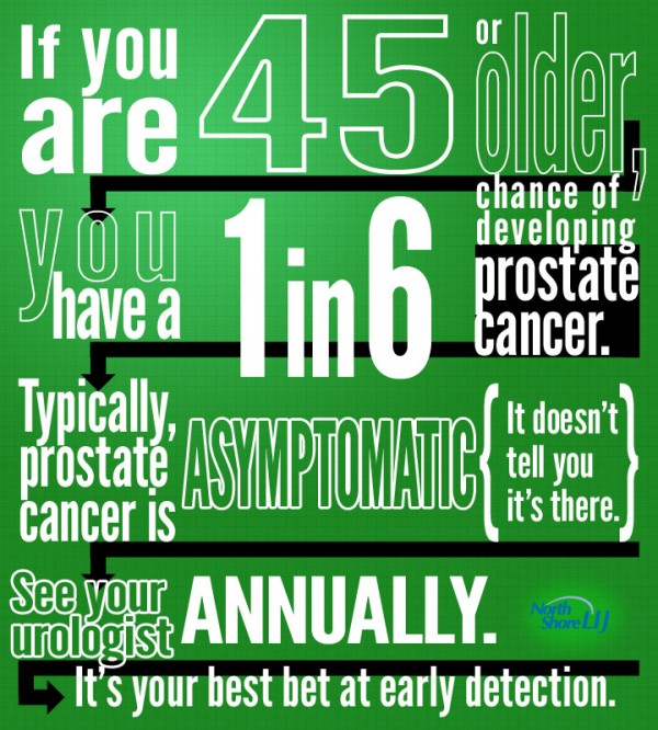
I came across an infographic today that typifies the style, design and problems with many of the posters I witnessed. It demonstrates how the ‘noise’ of badly designed information, when presented en masse as a collection of competing displays, contributes immeasurably to the overwhelming sense of overload.

This is the description that accompanies the graphic:
We worked with Dr. Lee Richstone, Urologist at the Smith Institute for Urology to create a graphic that demonstrates the seriousness of prostate health. It also gives you your best tip, if you are over 45 years in age, see your urologist annually!
Does this graphic demonstrate the seriousness of prostate health?
Does it offer a ‘best tip’ to see a urologist if you are 45+ years?
Unfortunately, the answer to both these questions is absolutely no. Its not even a graphic, there are only 3 pieces of quantifiable data that could remotely be used to form a graphic (age, probability, appointment frequency).
The only thing this graphic demonstrates is that somebody has discovered WordArt and has decided to take a perfectly straightforward paragraph of text, break it down into smaller snippets and apply a series of random font styles. Consequently, because the underlying paragraph is harder to fathom, clumsy black arrows, vigorously competing with the text for visual prominence, are required to guide the reader through the intended sequence of text.
If you apply the squint test, take a quick look at it and what stands out? Apart from the arrows, you probably notice the elements “If you are”, “1 in 6” and “annually” as the more dominant elements. However, the most critical piece of data in terms of targeting the information to the audience – “45 or over” – is probably the least instinctively noticeable item.
Critical Communication
The health service is unquestionably one of the most information rich environments and also probably the most critical context for the importance of communicating information most efficiently and most effectively. Unfortunately, bad practice in information design, whether it is relating to patient data, medical information or health advice, like the example shown here, has a significant negative impact on this exchange. Information overload, as evidenced by my experience in the waiting room, is rife and really needs to be tackled.

