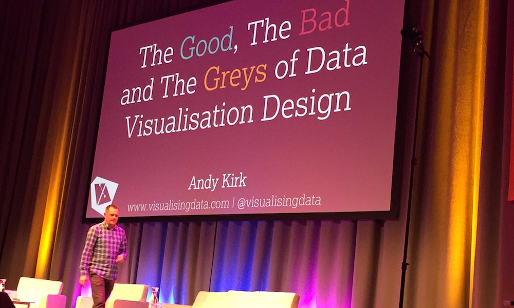
Yesterday I had the pleasure of giving a short talk at the Data Summit 17 conference, part of the Data Fest 2017 festival in Edinburgh. My talk was titled ‘The Good, the Bad and the Greys of Data Visualisation Design’ and was aimed at providing conference delegates with a resume of things they should do more of, others they should less of and matters they need to be carefully discerning about.
The slides are now available, published on SlideShare, and be viewed below. (Note that due to the amount of detailed images included in this deck some of the resolution has been compromised in appearance during the uploading process).

