
Earlier this week I published my slides from a talk I gave last week in San Francisco. One of the key things I discussed was the importance of carefully considering your editorial focus and I equated some of the ideas to the world of photojournalism. This is not a unique concept – it was brilliantly articulated by Moritz Stefaner in his article ‘Worlds, not stories‘ – but it is an approach to thinking about the subjectivity, the filtering, the focus, the sequence and the angles involved in selecting the slices of your analysis you will pursue. Yesterday the Washington Post published a graphic ‘The Wizards’ Shooting Stars‘ by Todd Lindeman and Lazaro Gamio that I think nicely demonstrates these ideas in practice.
The graphic explored some of the efficiencies and inefficiencies of the Washington Wizards’ shooting (by the way, we’re talking about basketball, should have said earlier) and how a few improvements could really help them realise their potential.
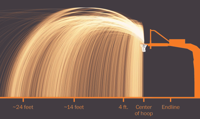
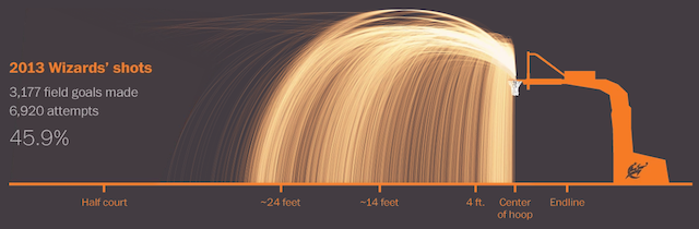
Firstly, we are greeted with the big picture of the main focus of the story: a general overview of point scoring based on the distance from where shots are taken. We can’t read the individual lines, we just get a gist of the patterns at this stage to form an introductory understanding. This begins the sequence of the storyboard, from the general overview initially towards a more deep understanding of the fine details.
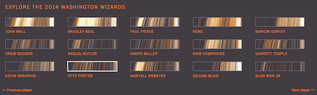
Next up we get an interactive panel of small multiples allowing us to interrogate the data from the different filtered angles of each player. Even as a non-basketball aficionado you can see the patterns of players who score closer the hoop and those who are aiming to score from further away (ie. to get the precious 3 pointers).
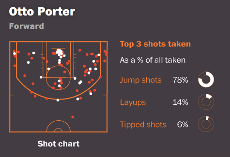
Having selected an individual player we can then explore in greater depth and detail their point scoring attributes. As well as the side-on view showing the distance and arcs of their points scored we now get a helicopter view to show the spatial pattern around the court as well as an array of more detailed statistics.
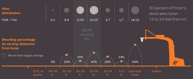
At the bottom we then have a more aggregated perspective of their scoring-distance patterns, moving away from the figurative nature of the individual shooting arcs towards a more statistical visual treatment.
This is a great piece of work. It has focus based on a clear initial trigger point of curiosity about the Wizards’ shooting performance. It has an array of different angles to allow us to look at the data from the most relevant different angles. It filters: not showing everything, but just what is need to support this slice of analysis. It has sequence, a starting point to frame the article followed by a journey into the more statistical depths of the subject. A really nice demonstration of the importance of editorial focus.
