
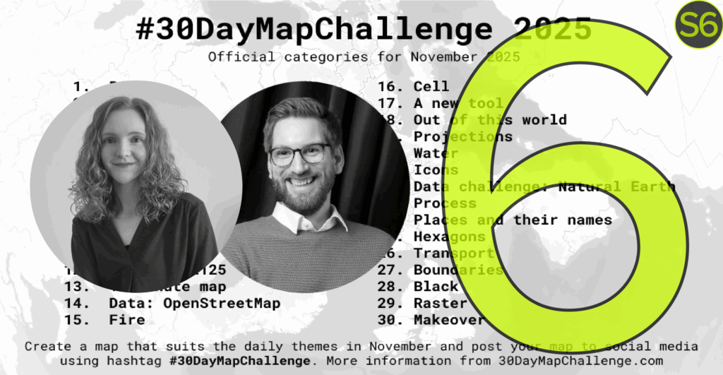
Welcome to episode 6 of season 6 of Explore Explain, a long-form video and podcast series all about data visualisation design. I am delighted to welcome Nicola Rennie, Data Visualisation Specialist based in the UK, and Ansgar Wolsing, Principal Data & Analytics Consultant based in Germany.
In this episode we explore five pieces each of their wonderful contributions to the annual ‘30 Day Map Challenge‘ campaign, as well as two of their favourites from other participants. Launched in 2019, by Topi Tjukanov, the idea is to create and publish maps based around different themes across each day of November using the hashtag #30DayMapChallenge.
- Ansgar: Day 3 Polygons, “Challenge Classic: Create a map focused on area features (e.g., administrative regions, land use, boundaries). Use fills, patterns, and choropleth techniques.”
- Nicola: Day 7 Accessibility, “Map how people (or things) get around. Visualize travel time, barriers, inclusive design, public transport reach, or create a map that is itself highly accessible to all users.”
- Nicola: Day 10 Air, “Classical Elements 2/4: Focus on the atmosphere. Map weather, wind patterns, air traffic, pollution, or airborne transmission (e.g., pollen, sound).”
- Ansgar: Day 11 Minimal Map, “Challenge yourself to use the fewest possible elements (color, line weight, labels) while keeping the map clear, useful, and informative.”
- Nicola: Day 22 Data Challenge: Natural Earth, “Use the Natural Earth dataset as your primary source for a visually stunning small-scale world or continent map.”
- Ansgar: Day 24 Places and their names, “Focus on toponymy (place names). Experiment with font choices, label placement, typography, multiple languages, or the history and meaning behind a name.”
- Ansgar: Day 25 Hexagons, “Challenge Classic: Use hexagonal binning (hexbins) or a hexagonal grid system to visualize your data. Celebrate this beautiful and efficient tessellation!”
- Nicola: Day 25 Hexagons, “Challenge Classic: Use hexagonal binning (hexbins) or a hexagonal grid system to visualize your data. Celebrate this beautiful and efficient tessellation!”
- Ansgar: Day 28 Black, “(Black Friday) Interpret the theme of Black. The map can be purely monochromatic, represent absence/darkness (e.g., light pollution), or relate to themes of consumption.”
- Nicola: Day 29 Raster, “Challenge Classic: Map using raster data. Focus on satellite imagery, elevation models (DEMs), land cover, or pixel-based art.”
- Nicola’s +1 by @stevefaeembra: Day 16 Cells, “Map something composed of small, discrete units or networks. This could be a geographic cell (raster, tessellation), a cellular network, or a biological/social process (e.g., disease spread).”
- Ansgar’s +1 by Alexandre Médina: Day 30 Makeover, “Take a map you made during the month or an older piece and redesign it. Focus on improving the aesthetics, clarity, or data communication.”
Video Conversation
You can watch this episode using the embedded player below or over on the dedicated Explore Explain Youtube channel, where you’ll find all the other video-based episodes and curated playlists.