Nigel got in touch with me late 2023 to ask “what you do to try to stay in some sort of shape: do you do anything? Running? Weight training? Treadmill? Yoga? At home? In a gym? Golf? Tennis? Swimming? Ski jumping?“.
After brushing away initial concern that he was writing to critically comment on my ‘some sort of shape’-ness, I realised he was instead enquiring to see if I had produced any prior visualisations on such a topic and, if so, would I be willing to contribute them towards the next book he was working on?
I didn’t have any existing workmatching that brief, but I did have some data, with a year’s worth – and growing – of recorded details relating to aspects of my fitness and health. This data was just gathering spreadsheet dust, sat there yearning to be analysed.
I therefore agreed, with a huge sense of appreciation for the opportunity, to work on something new using this data that may be submitted for his consideration for inclusion. And, thankfully, it was included, in a chapter showcasing other graphic contributions from fellow information design friends in the field.
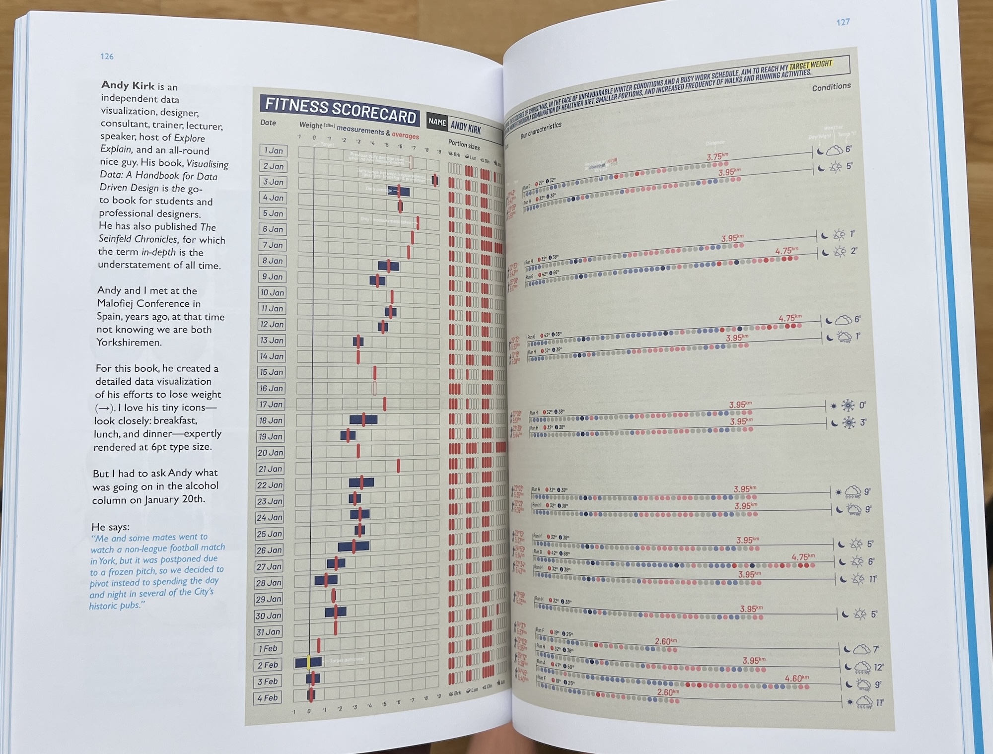
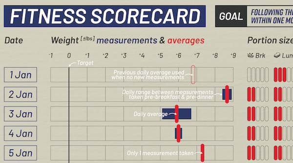
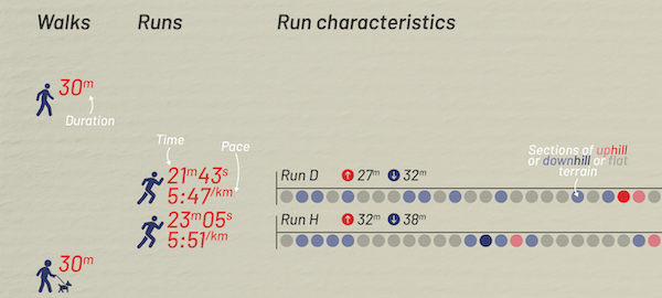
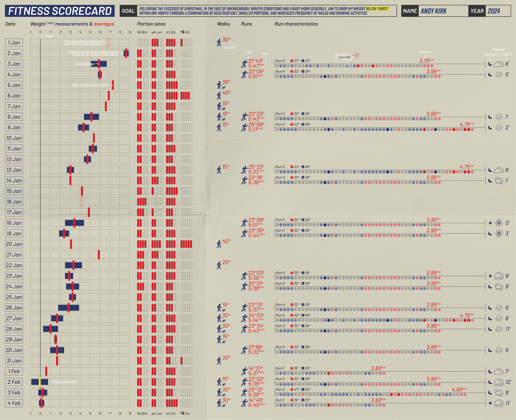
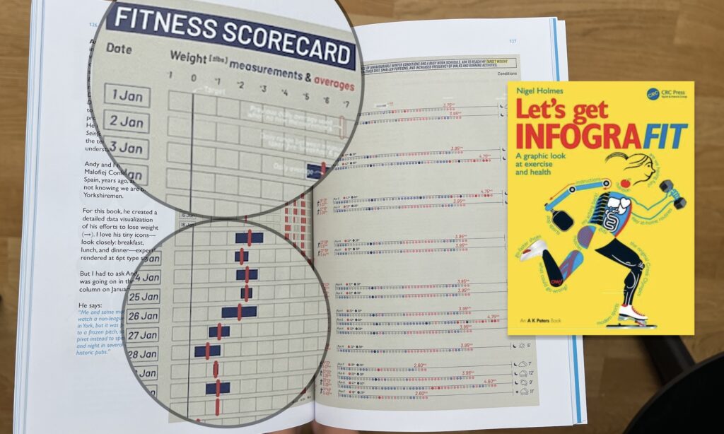
The graphic I created takes the form of a personal fitness scorecard, based on self-recorded data covering my daily weight, food portion size across meals, alcohol consumption, and exercise activities with granular details of outdoor runs especially.
This was initially framed over a period of 10 weeks – the 5 weeks leading up to Christmas day and the 5 weeks after – but having worked up an initial version I then re-read the brief and realised I’d misunderstood the graphic dimension requirements and so I had to kill those initial 5 weeks for space reasons. This wasn’t the worst thing to do as I caught Covid and did nothing but eat over Christmas so there was a large void in my fitness activity data!
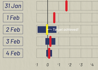
My goal, as stated in the final graphic, was “Following the excesses of Christmas, in the face of unfavourable winter conditions and a busy work schedule, I aim to drop my weight below target within one month through a combination of healthier diet, smaller portions, and increased frequency of walks and running activities.”
I designed it with an aesthetic style inspired by 1950s baseball scorebooks, with folded-cardboard background and a limited colour palette of blue red and white, and with a typeface and icons similarly inspired by aspects of that mid-century, retro-futurism era that, at the time of producing the graphic, I was exposed to through the TV show ‘Fallout’.
I was happy enough with the outcome of the design (and also the fact that I reached my target weight objective, so nice that would be captured in the data and the graphic!). I just wished I’d fully proofed how the white annotated text would look in the eventual published graphic, which appeared fine on screen and in draft pdf but, ultimately, I feel gets lost contrast wise in the published graphic – that’s my responsibility and my error, not Nigel’s nor the publishers.
Here’s a copy of the final short/squarer version published in the book.
If you’d like to see a gif of the design process and version iterations, click on the below…