
Welcome to episode 2 of season 6 of Explore Explain, a long-form video and podcast series all about data visualisation design.
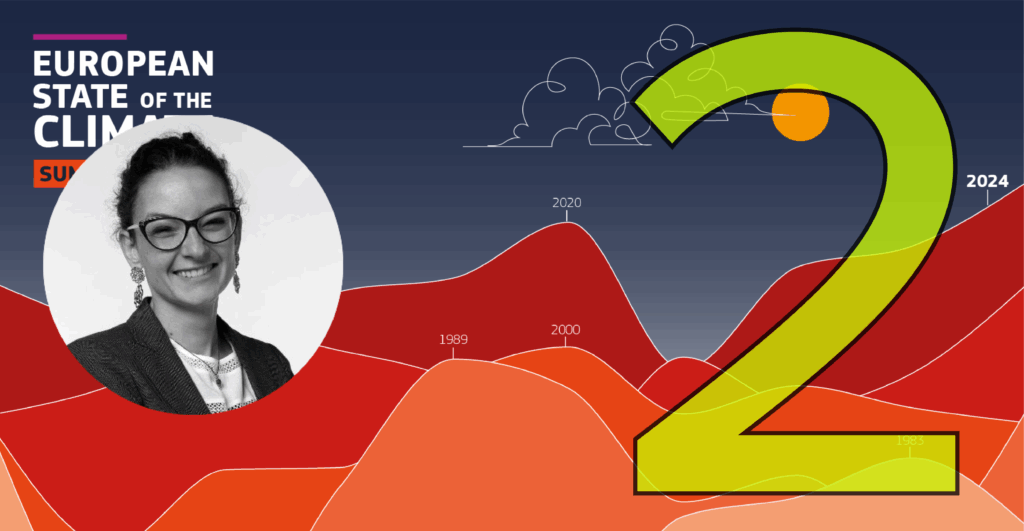
In this latest episode, I am delighted to welcome Dr Anna Lombardi, Climate Data Visualiser for Copernicus ECMWF, who is based in the UK. We explore the story behind Anna’s extensive data visualisation and design contributions to ‘The European State of the Climate 2024‘, which offers a detailed overview of climate conditions in Europe and the Arctic region in 2024, based on the close collaboration of 100 scientists and experts across the world.
Here are links to some of the key references or resources mentioned during this episode:
- The report’s executive summary
- The full report in pdf form
- The report’s graphics gallery
- Anna’s ‘behind the scenes’ article about “The role of data visualisation in the European State of the Climate 2024“
- The mentioned World Bank report ‘Atlas of Sustainable Development Goals 2023‘
- Simon Scherrer
Post-recording, Anna was keen to mention the following:
“I realised I didn’t take the opportunity to thank the rest of the editorial team and communication team here at ECMWF, as well as the external agencies we work with that closely worked with us to put the PDF layout and website in place, and who worked on the social media campaigns, media briefing etc. None of this would have been possible without them.”
She also felt it important to clarify the role of ECMWF:
“Copernicus is the Earth Observation component of the European Union’s space programme. It is organised in six thematic services, managed by entrusted entities on behalf of the European Commission. ECMWF (the European Centre for Medium-Range Weather Forecasts) is managing the climate change service (which coordinates the ESOTC report) and the atmosphere monitoring service.”
Video Conversation
You can watch this episode using the embedded player below or over on the dedicated Explore Explain Youtube channel, where you’ll find all the other video-based episodes and curated playlists.