
Data in the Wild #6: Becoming One With Traffic
Welcome back to Data in the Wild, the series where we highlight everyday examples of data visualisation in action. Today, we’re looking at how Google Maps predicts traffic before you even leave the house.
Data in the wild #17: Smart motorways
Smart motorways are quietly shaping how we drive. That sudden drop from 70 to 50? It’s not random. Sensors and systems are predicting traffic before it happens, slowing everyone down to prevent jams. It’s data controlling the road in real time… the question is, do we actually trust it?
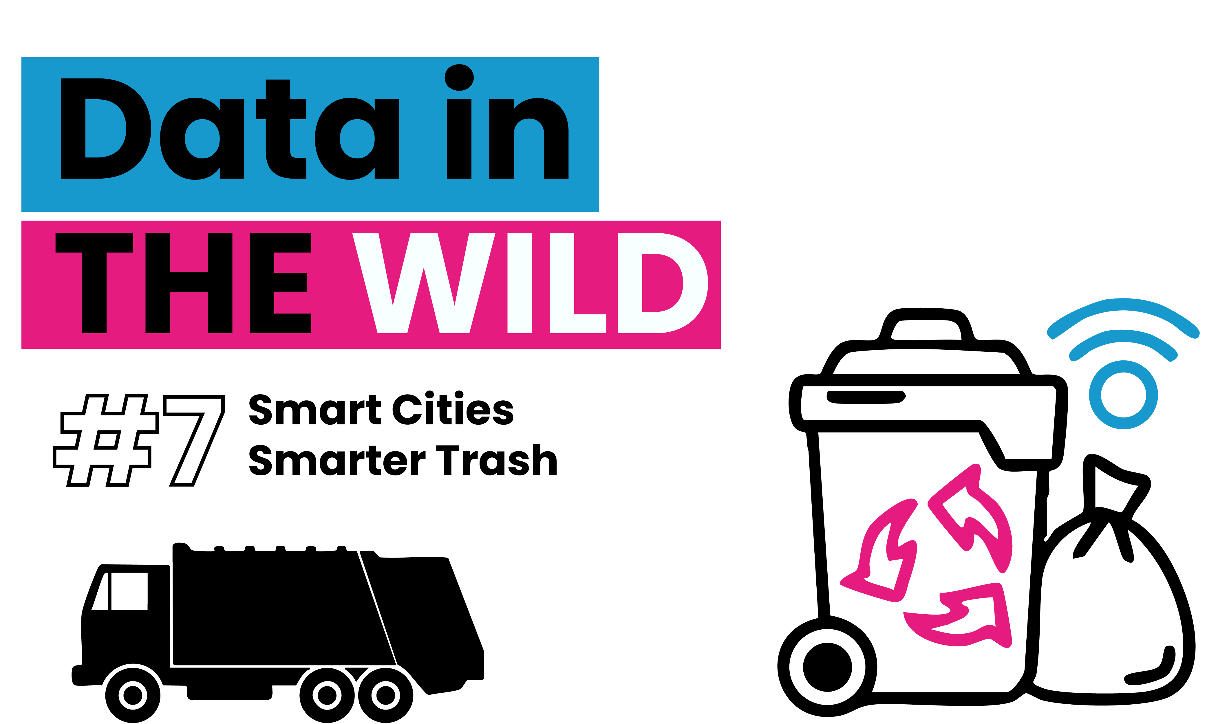
Data in the Wild #7: Smart Cities, Smarter Trash
In this edition of Data in the Wild, we’re looking at smart waste bins trash cans that don’t just sit there but use IoT sensors to track waste levels, optimize collection routes, and cut CO₂ emissions. Your trash is now data, shaping smarter cities one bin at a time.