Ideas are great…till they aren’t
We’re living in one of the most data-literate eras in history. From COVID trackers to election polls, the average person interacts with data more frequently and more critically than ever before. In fact, here in good ol’ Great Britain, we even run our homes on data… well, sort of.
Back in 2009, the UK government announced an ambitious plan: a nationwide rollout of smart meters to replace traditional gas and electricity meters. The idea was simple: give people real-time insight into their energy usage, help them make informed decisions, and take the guesswork out of energy billing. Fast forward over a decade, and while millions now have smart meters, the journey has been anything but smooth.
The Smart Meter Sagas: A Timeline
- 2009 – The Government announces the smart meter rollout, aiming for full national coverage by 2020.
- 2011 – Installation begins, primarily led by energy suppliers.
- 2017 – Deadline extended to 2024 due to delays.
- 2019 – Government reaffirms commitment to the program.
- 2020 – Focus shifts to tackling rollout challenges and consumer education.
- 2023 – New target: 80% of homes and 73% of small businesses in England, Scotland, and Wales to have smart meters by the end of 2025 (National Audit Office).
It’s been a bumpy ride, and we’re still not there. But this isn’t about energy policy or government targets. We are here to talk about data in the wild!
Welcome back to Data in the Wild, the series where we uncover how data shapes our everyday lives in ways we barely notice. As always, it’s a pleasure writing for an audience who understands that it isn’t a question of whether there is data or not, it’s whether you can get away with webscraping or not. Today, we are talking about smart meters visualising energy in our homes.
So, What Is a Smart Meter?
Unlike traditional meters, which just log your total energy use, smart meters record consumption and cost data in near-real time, typically every 30 minutes. This data is sent automatically to your energy supplier and displayed on a small screen inside your home.
Before smart meters, most UK households had separate meters for gas and electricity. To track usage, you’d either submit readings yourself or book an engineer to check. The alternative? Estimated bills based on your “likely” usage leading to overcharges and plenty of frustration.
Smart meters solved this by removing the middleman. They transmit data via a communications hub, reducing the need for manual readings. More importantly, they hand some of the power back to the consumer. With a visual display showing your usage by day, week, or hour, you’re theoretically empowered to make smarter, greener, and cheaper decisions.
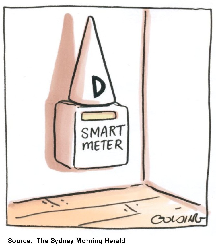
In Theory, Anyway…
The smart meter rollout has had more than its fair share of glitches:
- Tied to suppliers – Early meters were often incompatible with other providers, making switching a headache.
- Display malfunctions – Users have reported frozen screens, missing readings, or failed updates.
- Data errors – Transmission issues sometimes led to incorrect bills, eroding trust in a system that was meant to restore it.
These aren’t just technical hiccups, they’re design failures. Because here’s the thing: a data visualisation is only as good as the ecosystem that supports it. If the tech is buggy, the rollout clunky, and the users unprepared, even the prettiest interface won’t fix the problem.
What Smart Meters Teach Us About Data Design
Smart meters should be a win for data-driven decision-making. But this case study highlights a key truth: data visualisation alone isn’t enough. For any data solution to work at scale, you need:
- Robust infrastructure – Data has to be accurate, consistent, and timely. No one trusts a laggy or buggy system.
- User literacy – People need to understand what they’re seeing and why it matters. That includes education and intuitive design.
- Trust – Once people lose faith in the data, even the best tools get ignored or abandoned.
We often fall into the trap of assuming that once the data is visualised, the job is done. But that’s only the start. Rollout matters. Design matters. Adoption matters.
So yes, smart meters are a great example of data visualisation in the wild. But they’re also a cautionary tale of how not to implement a data solution. As we become more data-savvy, we’re also becoming more demanding. And rightly so.
See you next time for more Data in the Wild!
Data in the Wild #7: Smart Cities, Smarter Trash
In this edition of Data in the Wild, we’re looking at smart waste bins trash cans that don’t just sit there but use IoT sensors to track waste levels, optimize collection routes, and cut CO₂ emissions. Your trash is now data, shaping smarter cities one bin at a time.
Data in the wild #15: The Data Behind Fireworks
Fireworks don’t just light up the sky they’re shaped by data. From wind modelling to sound limits, invisible thresholds decide what counts as “safe fun.” This Data in the Wild piece explores how decibels, maths, and regulation quietly shape one of our most beloved celebrations.
Data in the Wild #6: Becoming One With Traffic
Welcome back to Data in the Wild, the series where we highlight everyday examples of data visualisation in action. Today, we’re looking at how Google Maps predicts traffic before you even leave the house.

