Urban planners love this stuff.
It tells them where footfall is high, where it is slowing down, and what times of day people are most likely to appear in certain places. It helps them know which parks are underused, which areas need more lighting, where to install benches, bins, public toilets, and cycle racks. It is basically people analytics for streets.
How we walked through a pandemic
During COVID, this data went from interesting to essential. Councils used it to track whether people were following social distancing rules, whether parks were overcrowded, and how lockdowns affected high streets.
In some cities, the data helped shape decisions around which bus routes to expand or reduce. In others, it revealed which neighbourhoods recovered quickly and which were slower to bounce back. Footfall data became a new way to measure urban resilience.
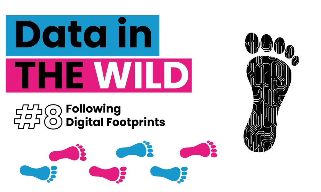
No one is tracking you personally. But if 500 people pass through Oxford Circus at 3 PM, the system logs that “500 devices moved through this area.” No names, no faces, just digital footprints.
But this isn’t just about crises
Think about big events: Notting Hill Carnival, Pride, or a Taylor Swift weekend at Wembley. City planners use real-time footfall data to manage crowds, redirect flows, and make sure emergency services are in the right place at the right time.
It is not always glamorous, but it is smart. Quietly, in the background, our collective movement is shaping the cities we live in.
Why data visualisation matters
Footfall data might sound dry on the surface, but once it is transformed into visuals, heatmaps of pedestrian flow, bar charts showing changes in shop visits over time, and dashboards tracking when and where people gather, it becomes useful, even beautiful.
That is the power of data visualisation. It does not just show us numbers; it reveals patterns, movement, and behaviour. It gives us the ability to see the pulse of a city in motion.
In a world overflowing with raw data, visualisation is what helps us truly see, not just look. Whether it is a council choosing where to plant new trees, a retailer deciding when to close up shop, or a city reimagining its public spaces, these decisions all hinge on making the invisible visible.
See you next time for another look at Data in the Wild.