
My work in the data visualisation field has never been overly-aligned with the technology side of things. I’ve always focused my approach towards transferring knowledge about the underlying craft of visually communicating with data, agnostic of technology.
However, you can’t ignore technology and the prominent role it plays in the practice of this craft. From gathering data, cleaning and transforming it, exploring it, analysing it, charting it, finessing its appearance, technology – or more accurately technologies – is key.
Questions about what tools are considered best or are most worth learning are understandably amongst the most frequently enquiries anybody ‘in’ data visualisation will get asked. Giving an answer to which is best or which are most worthy of attention will often unavoidably lead to a ‘it depends’ response.
In this post I want to try to at least direct you towards some useful resources that may at least help you, if you have a similar question in mind, find your own answers.
There are three sections presented here to offer some assistance:
- Firstly, hearing from people in the data visualisation community about what they’re using
- Secondly, sharing my updated catalogue of 300+ Data Visualisation Resources
- Thirdly, guiding you towards my Chartmaker Directory which presents nearly 1500 technical examples and/or solutions showcasing the chart-making capabilities of some of the most common tools.
Asking the Community
In preparing for updates to the resources I mention below, I posed a query to the data visualisation community via my social channels, asking people ‘what are the 3-5 primary tools they are using in their data visualisation workflow right now?’.
I collected responses on Twitter, Mastodon, and on LinkedIn and cross-referenced these with the results presented in the annual Data Visualization Society ‘State of the Industry‘ survey. Above all, I wanted to get a sense of the stack people employ, as it is rarely just one tool we use. Here’s a summary of the main – if not the full range of all – tools people suggest are typically being used.
Microsoft – Excel, Powerpoint, Power BI, Charticulator, Deneb
Tableau – with Alteryx or Prep for data handling, then Desktop or Public and sometimes then with Figma
Low code/no code – Datawrapper, Flourish alone or with Canva, RAWGraphs often with Adobe Illustrator
Google – Looker Studio, Google Sheets, Google Slides
Programming Libraries – D3.js (especially with ‘front-end’ frameworks like React and Svelte), Vega, Vega-lite, Observable, and Notable
RStats – R with ggplot2 or using Shiny and Rstudio
Python – matplotlib, Seaborn, Plotly
Mapping – QGIS, ArcGIS, Mapbox, Leaflet.js, WebGL
Design – Canva, Figma, Powerpoint, Adobe Illustrator (sometimes with Datylon), Sketch, Affinity Designer, Gimp, Inkscape
Animate/video – Blender, Houdini, Cinema4D
Productivity/team – Miro, Notion, ChatGPT
Sketching – Pen & paper remains king, for digital applications Procreate and Excalidraw
The 'Data Visualisation Resources' Catalogue

My long-running catalogue of Data Visualisation Resources has for many years been the most-popular, most-visited, and most-referenced content on my website. For the last couple of years, though, it has been a little stagnant with my limited time preventing the frequent updates it needed.
Having recently completed the migration of my website to a new host and undertaken a wide-spread redesign and restructure, it felt an opportune moment to roll up my sleeves and belatedly spend some time pruning the catalogue of out-dated references and introduce all the new ones that I’d encountered, and bookmarked, but not yet added.
Finally, the new and updated catalogue is now ready for re-launching. It includes over 300 data visualisation and related tools. This number was once much higher but I’ve been more attentive to only include tools that are directly applicable for use in the creating of visualisations or play a supporting role in other aspects of this workflow, maybe for cleaning data, assisting with colour palette selections, or authoring video outputs. I’ve noticed a lot of tools that were once included now have dead links, have gone obsolete, have been acquired/merged, or are being discontinued by vendors who are withdrawing their ongoing support.
The resources listed are organised across seven categories, roughly positioning the tools based on their primary form or purpose.
CHARTING: This category includes applications for creating charts, visually exploring data and in some cases developing interactive solutions through no-code/low-code platforms.
CODING: This is a collection of libraries, frameworks, toolkits, and environments used for programmatically developing charts and dynamic visualisations.
COMPLEX: These resources are for handling more complex visualisation tasks involving multivariate and/or qualitative material.
MAPPING: These list some of the many packages, utilities, and libraries for mapping data and performing spatial analysis.
DATA: This is a selection of applications used for the collecting, handling, integrating, and transforming of data.
COLOUR: These resources are useful for generating and editing colour palettes, as well as practical, theoretical, and inspirational sources of guidance.
SPECIALIST: This ‘catch all’ category, finally, covers a broad collection of design, presentation, publishing and other niche resources that can supplement the visualisation development workflow.
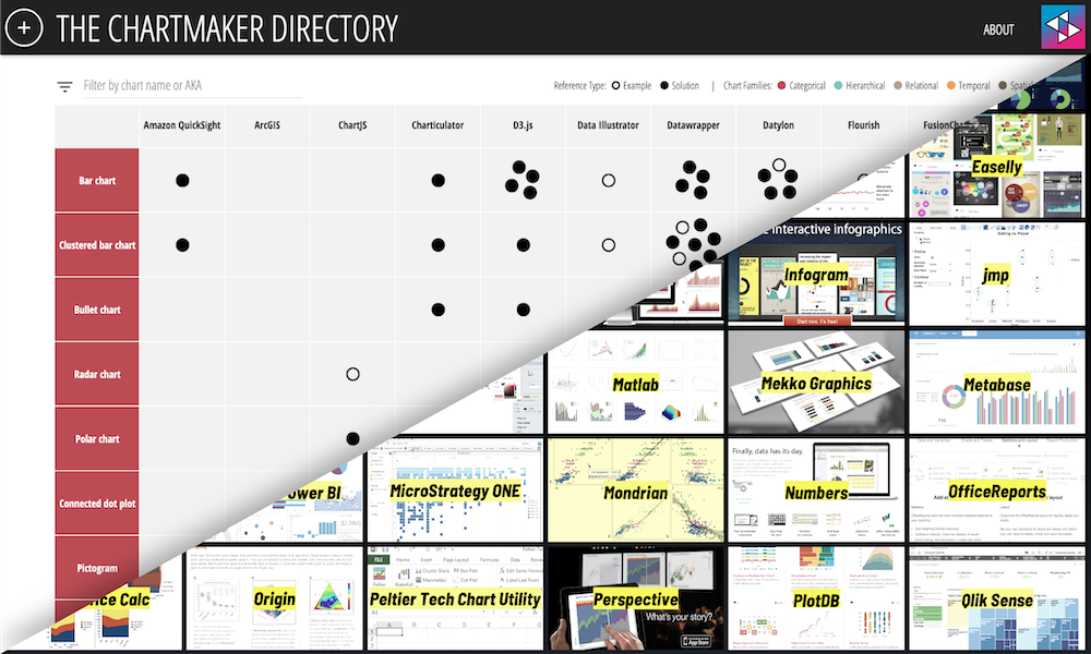
The Chartmaker Directory

The ‘Chartmaker Directory‘ is a popular catalogue of examples and solution references to help answer common questions that get asked about the capability of different tools with respect to making different charts.
It includes around 40 of the most common tools, drawn from the resources catalogue, whose primary purpose is making charts. The directory then displays 50 distinct chart types and at the intersecting cells for each chart-tool combo, where relevant, are links pointing to examples (indicating the particular chart is possible to make in the particular tool) or, more usefully, to solutions that give the answer to ‘how’ (to make that chart, in that tool).
The directory began life as an organised repository of my collected bookmarks, but was then expanded to become a crowd-sourced and openly published resource, available for anyone to access and contribute.
Though it does not claim to be – nor could it ever be – an exhaustive directory, with nearly 1500 references and growing it should at least offer a useful and practical guide to help you understand what tools can make which charts, and which charts can be made with what tools.
