
To mark each mid-year and end-of-year milestone I take a reflective glance over the previous 6-month period in the data visualisation field and compile a collection of some of the most significant developments. These are the main projects, events, new sites, trends, personalities and general observations that have struck me as being important to help further the development of this field or are things I simply liked a great deal. Here’s the full compilation of all my collections.
In August last year I published a collection for the first 6 months of 2019 and now I’d like to reflect on the last 6 months of 2019.
And so, as ever, in no particular order…
1. Giorgia Lupi joins Pentagram
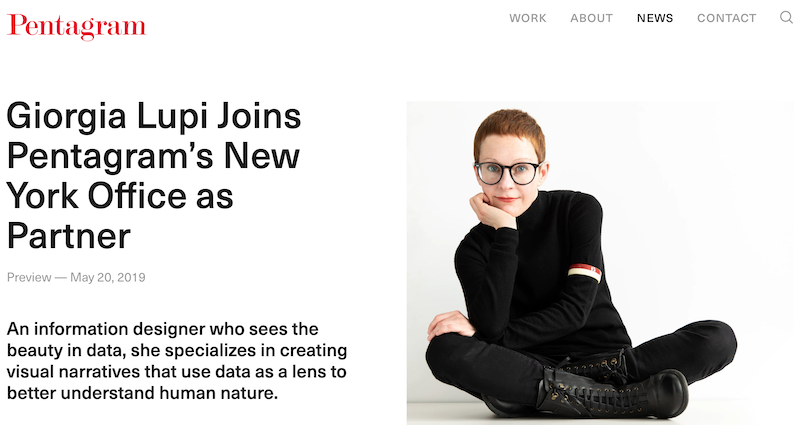
(Although this news was announced towards the end of the first half of 2019, and thus technically disqualifying for inclusion here, I’m allowed to cheat because, ultimately, it is I who makes the rules for this game.) Giorgia’s talent and standing in the field has been clear for all to see, for some of us, as far back as 2013, so it is wonderful to see her being rewarded with one of the most esteemed career moves in the design industry: becoming a partner at Pentagram, New York. This is unquestionably a significant milestone, as expressed in this piece, which not only recognises that Giorgia is the first new Pentagram partner in New York for seven years, but that in doing so as an Information Designer, this move “represents a further effort on the part of the design firm to expand beyond traditional graphic design”. She has already been busy creating a “data-driven fashion collection inspired by three trailblazing women in science” and I can’t wait to see the future holds. Congrats Giorgia!
2. Nightingale: The new ‘Journal of the Data Visualization Society’

In my previous 6-monthly roundup I included the significance of the launch of the Data Visualization Society, which has been an absolute success story. One of the extended manifestations of the DVS has been the launch of ‘Nightingale‘, a Medium partnership, which represents a new platform for publishing articles on “current issues in data visualization for professionals and a general audience”. Editor-in-chief Jason Forrest with fine support from a wider group of skilled editors are doing a superb job of collating, curating and commissioning a wonderfully diverse repertoire of articles from a wonderfully diverse range of authors.
3. Toph Tucker article
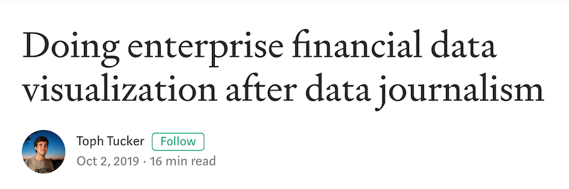
Continuing the theme of writing about data visualisation, this was one of the most insightful articles I read all year, written by Toph Tucker. As the title alludes, this is a collection of observations contrasting Toph’s experiences in his new role doing enterprise financial data visualization after moving from a career in data journalism. He expertly dissects the hidden cultural and contextual constraints that affect how he goes about his work now compared to his previous role, across a range of headings such as ‘the people’, ‘the market’, ‘the incumbents’, ‘the normal forms’, and ‘the limits of the craft’. Very much worth 16 minutes of your time.
4. National Geographic’s ‘Sacred Mosaic’
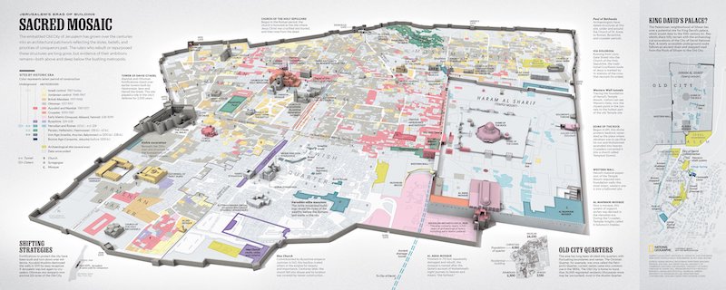
Anyone who keeps on top of the latest and greatest data visualisation works will already be familiar with the outstanding talent and craftsmanship of Alberto Lucas López, Senior Graphics Editor at National Geographic. This piece is another tour de force from Alberto alongside several colleagues as the National Geographic visualises the 3000 years of “worship, conquest, devastation, and rebuilding” that have shaped modern Jerusalem. Aside from the best-in-class visual solution, what stands out for me with this piece is the depth of the background research that went into discovering the information you see portrayed in this piece. It is the quintessential embodiment of what visualisation is about: making the invisible visible, on several levels. As is now the norm with all his published works, Alberto also generously shares a fantastic Twitter thread stepping through some of the details of the behind-the-scenes creative process.
5. Alberto Cairo’s “How Charts Lie”
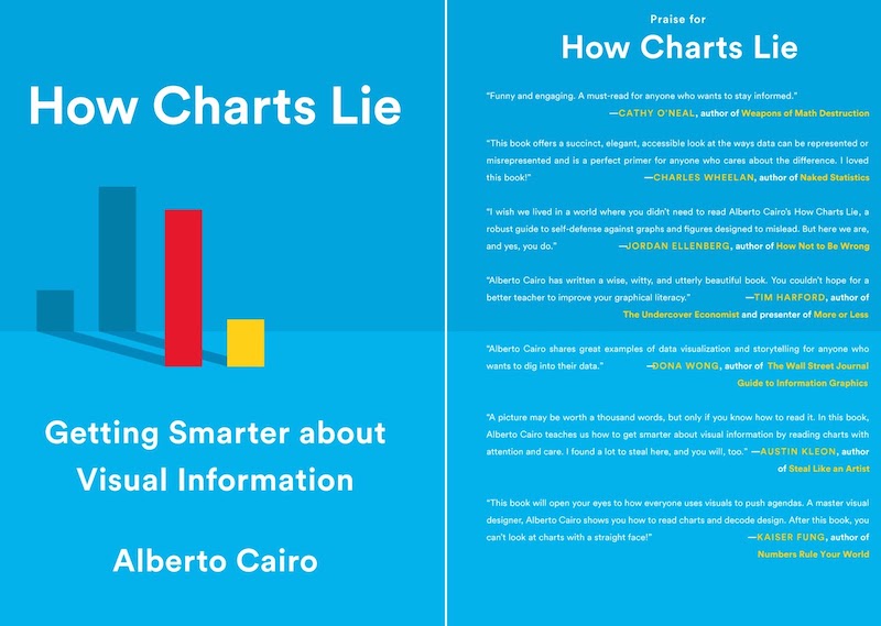
With a nod to the famous work of Darrell Huff, Alberto’s latest book, published in October, offers a vital text for our era, setting out in accessible form the different ways that we can lie or be lied to through charts. Building on his stellar work delivering his ‘Visual Trumpery’ lectures around the US and beyond, this book continues Alberto’s passion to help audiences and creators alike get smarter about this crucial literacy. For the bad actors out there, please just don’t use this as a helpful ‘how to’ guide.
6. Topi Tjukanov’s #30DayMapChallenge
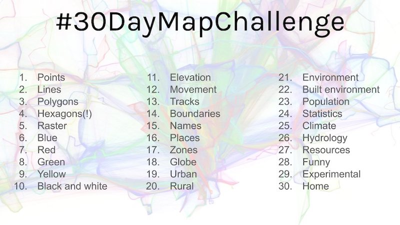
The #30DayMapChallenge was a wonderful idea from Topi Tjukanov taking the form of an open challenge for people to create ‘a map a day for each day of November’. The rules were simple: no restriction on tools, but all maps should be originals created by each participant. As the image above shows, each day had a different creative theme or restriction and the results were amazing, as collected by Dave Friggens. Look out for the 2020 edition coming up again later this year.
7. 50th anniversary of the Apollo 11 moon landing
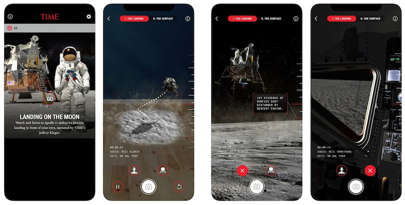
I’m always fascinated by the variety of works that emerge from the visual reporting of big events or the marking of anniversary occasions. 2019 saw the 50th anniversary of the moon landing and unsurprisingly this led to a wonderful array of pieces, including (but not exhaustive) the immersive AR piece from TIME as shown above, ‘Apollo 11: As they shot it‘ by the New York Times, ‘Countdown to a New Era in Space‘ by National Geographic, ‘Man on the Moon‘ by Reuters, this NZZ explainer video as presented via a nice Twitter thread, ‘Neil and Buzz go for a Walk‘ by RJ Andrews, and ‘How to Dress for Space‘ by Washington Post.
8. Jessica Hullman
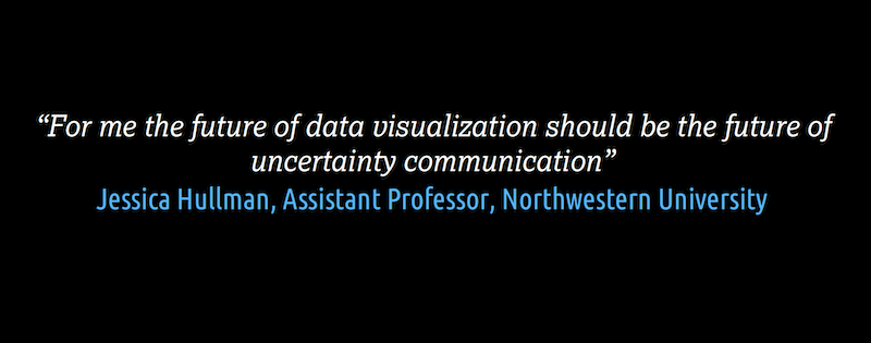
If I had to pick a single quotation that has had the most impact on my thinking over the past year, it would be the one above, shared with me during a research email conversation with Jessica Hullman. Jessica is Assistant Professor of Computer Science & Engineering at Northwestern University, and director of the MU Collective lab devoted to information visualisation and uncertainty cognition. She is a leading academic in the field and has one of the most vital research agendas befitting the times in which we live: “my mission is to help more people make sense of complex information, and in particular to reason about data under uncertainty”. To get a flavour for her work, check out this compelling article ‘How to Get Better at Embracing Unknowns’ published in September in Scientific American (also available here without paywall).
9. Tim Meko
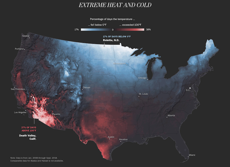
Tim Meko is Deputy Graphics Editor at the Washington Post and is one of the most talented and experienced visualisers as well as being, in particular, amongst the finest cartographers on the scene. The map shown above is one of several distinct thematic techniques published in an article ‘Mapping America’s wicked weather and deadly disasters‘ which is an outstanding exhibition of his skills. Check out his wider portfolio at the Washington Post for relentless inspiration.
10. Visualising large-scale phenomena
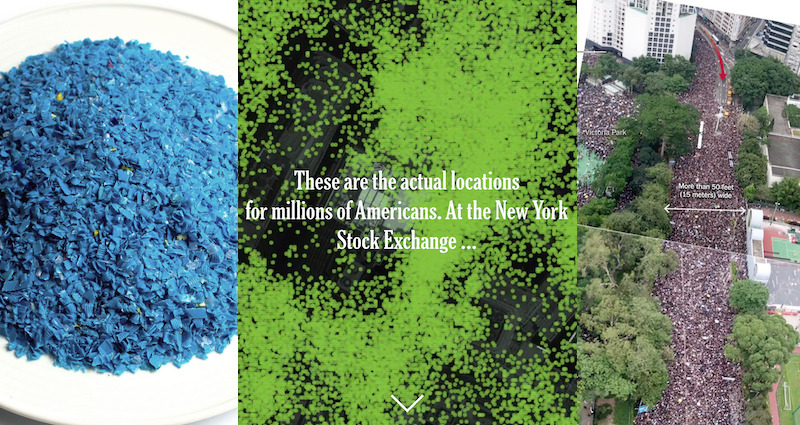
One of the enduring challenges in visualisation is effectively representing large values in ways that capture the sheer scale of phenomena. In the last few months of 2019, we saw several pieces from Reuters and the New York Times that demonstrate brilliant techniques for achieving this. From Reuters, the Drowning in Plastic and A Plateful of Plastic works focused on representing huge quantities concerning the topic of plastic waste. The Times did a superb deep investigation into mobile phone surveillance in ‘Twelve Million Phones, One Dataset, Zero Privacy‘ as part of the ‘Privacy Project’. Additionally, both Reuters and the Times employed particularly novel methods for quantifying and displaying analysis about the crowd sizes during the Hong Kong protests.
Special mentions…
Here are the other highlights from the second half of 2019 that deserve a special mention:
Measuring Gender Imbalances | I’m a huge fan of Cath Sleeman’s work and this piece for Nesta contains so many typically astute, thoughtful little details
Martin Telefont | Martin published two super nice projects which offer a sideways illustrative glance at the data visualisation field, 100 Days of Dataviz Comics and Dataviz Butterflies
Clever°Franke’s Eurovision work | From last year but with implications for 2020, Clever°Franke have worked on a huge-scale and great-looking visual identity campaign for Eurovision 2020 in the Netherlands
A House With a Yard on Every Lot | From the NYT, this wonderfully vast piece demonstrates them at their best, pursuing interesting data curiosities in the most accessible and beautifully elegant way
Flerlage Twins | There are talented, prolific developers pushing the boundaries of Taleau’s capabilities and then there are the Flerlage Twins who set a whole new benchmark.
