As consumers of visualisations, before we form interpretations and conclusions from the charts we see, we have to remember that they are only a visual display of the data that has been collected and the way that data has been transformed.
What we see is not always an objective reflection of the underlying topic or phenomena rather it is a reflection of what data exists and what’s been done to it. A demonstration of this point can be found in this example from FiveThirtyEight’s ongoing tracking of the President’s approval rates.
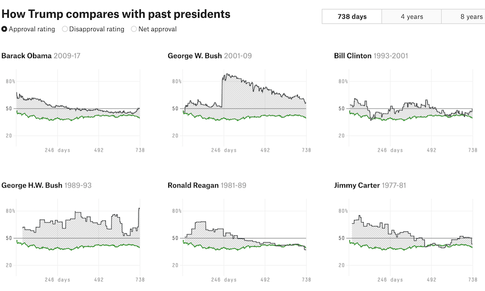
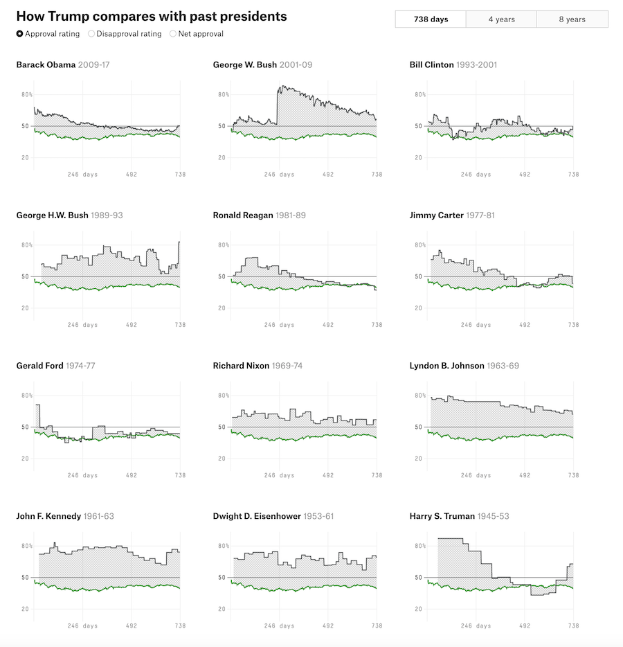
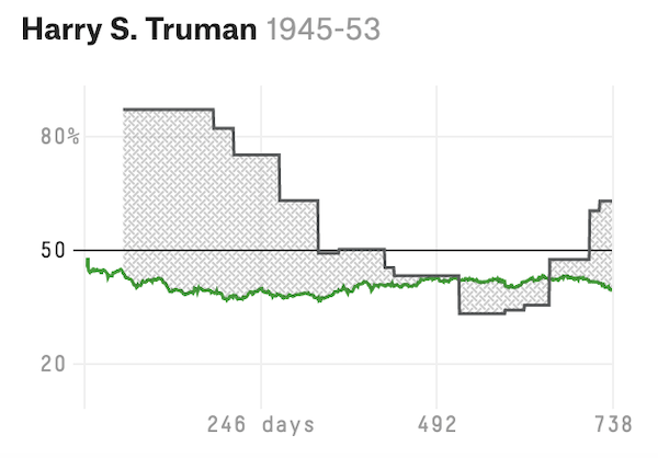
In the multiple chart panels we see how each president’s approval ratings compare to Trump’s (green line) from the day they took office up to the current point in time. Whilst the patterns of approval are interesting, they reveal as much about the advances in data collection and convey the result of hidden statistical treatments applied to the collected data.
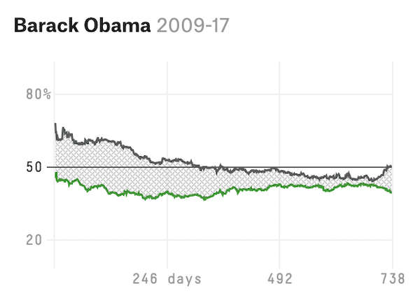
We take for granted the daily updates to polling day, not just from single polls but from multiple sources. The approval data we see about Trump and, looking back, for Obama is frequently updated and represents a calculated mean of the various sources, as explained here, accounting for the quality of each poll, recency, sample size and partisan lean.
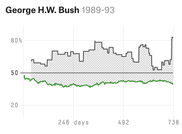
Looking back to George H. Bush’s approval ratings, only 30 years ago, you see how the profile of his line is more cityscape than landscape, reflecting the lower frequency of polling data being collected.
Going further back in time to Harry S Truman, you can now count from the chart only 14 updates to his approval ratings over 738 days (assuming there were never consecutive polls at the exact same level). You can also see that the first occasion of a poll being collected was on day 55, the second on day 181. The shape of this line does not mean the approval of his performance in office remained unchanged for 126 days, it means data about the approval of his performance wasn’t collected for 126 days.
All this is to say be careful in what you draw from charts and always ask questions about the data that underlies it. That’s not to say that the subjectivity of collection methods and statistical techniques applied are universally unreasonable, quite the opposite, but be diligent.

