After a long time sat patiently on my would-like-to-do list I am delighted to release a new project titled ‘The Chartmaker Directory‘.
WHAT IS THE CHARTMAKER DIRECTORY?
Over the past 5+ years, during which time I have delivered more than 200 data visualisation training events to over 4500 delegates, the question I unquestionably get asked the most is ‘which tool do you need to make that chart?’.
It is a question I often find hard to answer elegantly as it is often weighed down with the classic baggage of “it depends”. Above that, there is such variety in the ways of expressing data visually and arguably an even broader variety of tools offering the means to do so, ranging from simple solutions to the more complicated. It is a large, complex and ever-changing landscape to have to make sense of.
With my training and, by extension, my book primarily emphasising the importance of critical thinking and the underlying craft of data visualisation – the ‘what’ and the ‘why’ – I have been seeking to substantiate this content with solid guidance about the critical matter of ‘how’.
This is what motivated the development of the The Chartmaker Directory: an attempt to gather and organise a useful catalogue of references that will offer people a good sense of what charts can be made using which tools and, where necessary, how.
WHY A ‘BETA’ LAUNCH?
The are two reasons for a beta launch.
Firstly, any digital project needs to be tested to ensure it is functionally robust in a live, concurrent user environment. Hopefully it performs ok in this launch period but if there are any bumps in the road, please let us know.
Secondly, this resource offers a repository to house references to the wonderful array of work and helpful content people are publishing every day to help showcase the spectrum of data visualisation tools and their capabilities. I have done some groundwork to establish the foundation of content with an initial collection of 200+ references but this is only a starting point.
The content compiled on this site will be greatly enriched by being partly crowd-sourced and so I am relying on the goodwill and knowledge of people out there to assist in expanding the references further. I can spend an inordinate amount of time searching for contents on Google but I want to be more incisive in the gathering of the best references from you and be less shaped by what I happen to find.
Therefore, through this beta launch, I want to whet the appetite to encourage contributors. Where you see gaps and think “but I’m sure you can make that chart with that tool?” you will be right, so submit a suggested reference and help grow this directory. There is a long way to go before this represents a truly comprehensive collection.
The best experience for this resource is through the desktop view. This is simply because there is more visible space to offer users to navigate around and interact with the contents. The mobile version offers a slimmed down format that provides a simpler interrogation method suitable to the platform, which enables quick retrieval lists of references based on your desired criteria (ie. driven by the tool and/or chart of interest).
THE DIRECTORY’S CONTENT
The way you explore the directory will depend on your specific motive for browsing the content. You might have different entry points expressed through the following questions:
- If I want to make a certain chart with which tools can I make that?
- If I want to invest in a given tool which charts will it enable me to make?
- If I want to make a specific chart in a given tool, but don’t know how to create it, can I find a solution to help me?
- If I am a vendor looking to enhance my tool’s capabilities, which chart types am I missing and which appear to be under-served by competitor offerings?
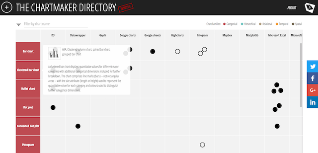
To answer these curiosities, the directory’s content is presented through a simple matrix. Across the top are a selection of chart-making tools and a comprehensive list of different chart types are presented down the side. Within the intersecting cells, you will find unfilled and filled circular markers representing a reference in the directory.
An un-filled circle represents a link to an example, providing visual evidence that a given chart can be made in a given tool – read it as “here’s a link to a bar chart made using Excel”, for example. A filled circle represents a link to a tutorial, providing both an example and guidance for how to make a given chart in a given tool. Tutorials might exist as how-to step-by-step instructions, how-to video demonstrations, downloadable workbooks/templates or might provide reusable code. Think of examples as an illustration that a chart can be made in a tool, tutorials as the provision of a solution to make a chart in a tool.
A few of points about these references. Firstly, not all chart-tool combinations require tutorials, simply knowing a chart is possible to make in a given tool can be sufficient in many cases. Whilst most people using Excel will know how to create a bar chart easily enough – as a standard, off-the-shelf chart type – fewer may know how to create a connected dot plot as it is not a default chart option and involves more of a workaround solution. Secondly, the aim is to ensure the references included are publicly accessible tutorials/examples that don’t require memberships, paywall access, or the need to signup for white-papers.
Where you see gaps, initially, these will largely be indicative of unsourced references. As the content grows over time, the significance of these empty cells will shift to revealing the extent of a tool’s breadth of capabilities. However, it is important to state that widespread gaps for a given tool does not mean it is necessarily inferior to another tool that has many references. Few tools can realistically seek to offer everything and, indeed, many accomplished tools provide useful specialisation, such as mapping tools like Mapbox, which is only really ever going to provide capabilities for spatial analysis.
THE TOOLS
A particular tool’s inclusion is intentionally flexible and open for debate. I know what tools exist but I don’t know them all functionally, nor can I as there are simply too many. Indeed, I’ve never even had the chance to play with more than a fraction of the tools that are available so I can’t say with confidence what they are all potentially capable of. Additionally, there are some tool vendors with impenetrable sites that fail to showcase their explicit offering.
There are quite a few tensions for the criteria of inclusion:
- The tool responsible for a solution can sometimes be somewhat blurred as a visualisation task often involves several. Though most of the examples and tutorials curated will relate only with the associated tool column, some references may involve solutions that include the use of other tools. For example, one might use RAWGraphics to generate a data-driven chart, export it into svg format then place it in Adobe Illustrator to refine the appearance. My intention for examples like this is to position the example or tutorial reference be against RAWGraphics. Even though it was not produced solely within that environment it would have been the primary chart creating device.
- Some tools only really become capable chart-making devices when used in partnership with extendable libraries, extension packages or plugins. For example, R alone can make charts but R with the ggplot2 package is a combination that unlocks the potential for a much greater, more sophisticated visualisation capability to be achieved. Whether R should be presented alone or with ggplot2 – and how other similar related packages should be presented – is part of the dialogue I wish to encourage.
- A further issue is how to include capabilities of tools that build upon, facilitate or provide a different front-end experience to other tool, for example in the way Rstudio, Shiny, and INZight might in relation R. Should they be included as separate options or is it reasonable to house them under the general broad-church heading of ‘R’? Some tools are quite hard to pin down in terms of what they do themselves versus what they facilitate such as Plot.ly. Defining its role and its place is hard given the fluidity of what it is offering as a means to utilise JS, R and Python capabilities.
- The suite of tools that exist under the banner of a single vendor is also quite messy to define. In the directory, Tableau is presented as a single tool but should be considered to cover the capabilities of Tableau Desktop and Tableau Public. Likewise QlikView references cover QlikView and QlikSense. In some cases, the range of products under a single vendor family are quite distinct in their offering. Again, I welcome clarifications and suggestions for refinements.
- Some applications, like Adobe Illustrator, that unquestionably play a role in many peoples’ workflow (especially for static work), are not intended to be included because they aren’t necessarily responsible for the creation of a data-driven charts. You can make charts in Ai but it is a fairly primitive capability. Otherwise, you can use it as a means of manually drawing a chart piece-by-piece using the illustration tools. However, this directory is intended to represent a collection of references for the making of the charts not necessarily the creation of the final polished piece of work. It is also not about interactive features offered by tools to interrogate and enrich charts.
There are many people out there who are well-placed to help shape the inclusion of tools in this directory and I would encourage suggestions for additions/refinements. This is a further reason for the beta status of this launch though I’m sure it will be an ongoing conversation.
A quick note about the ordering of the tools. Initially, this has been set to alphabetical to facilitate quicker lookup but future iterations may see the sorting changed to emphasise the tools with the most through to the least references across the directory or grouping them to distinguish desktop vs. browser, programming vs. application, free/OpenSource vs. proprietary.
THE CHARTS
In contrast to the tools, the criteria for a chart type’s inclusion is far more fixed. The presented list has been shaped by my work creating a taxonomy of chart types for my recent book. They are representative, in my view, of most of the charts most people may ever need to use in their work. There are so many further subtle variations and derivatives – tweaking the deployment of marks and attributes – that an exhaustive collection is virtually impossible but this should represent a sufficiently comprehensive list for most peoples’ needs.
The charts are organised in to five families based on the focus of the analysis they primarily facilitate. These families form the acronym ‘CHRTS’, which stands for categorical, hierarchical, relational, temporal and spatial. The colour key at the top indicates the shaded associations. These families are not entirely exclusive as many charts will inevitably be able to facilitate multiple windows into your data but this organisation is hopefully a reasonably sensible grouping approach. A search box is provided at the top for you to search and filter the chart type list using entered keywords.
The chart names are, again, never going to be universally agreed upon. Different tools name the same chart type techniques differently to other tools, even when they are ubiquitous like the bar chart, which is often labelled a column chart. The chart names proposed merely represent a personal lexicon. Supplementing these names, however, are the ‘AKAs’ (also known as) which are included in the tooltip display when you hover over each chart. Furthermore, some of the references included will relate directly to the AKA chart names.
What this resource is not aiming to do is to guide you when to use a chart and when not to. As I’ve said above, my other offerings cover this focus so this resource is a supplementary aid. There will be some people outraged by the inclusion of the word cloud or the radar chart, most likely with good reason, but this is not the place to explore the nuances of when they are and aren’t appropriate chart types to use. If you have reasonable justification to use a chart type, this resource helps to guide you how and with what you can make it. I do, though, provide a short description in the tool-tips of each chart type to offer some context for their respective roles.
CONTRIBUTING TO THE CHARTMAKER DIRECTORY
In addition to exploring the content, the second way of using this directory is through contributing content. As I have stated, I am going to be constantly seeking out and incorporating examples and tutorials myself but one of the fundamental purposes of this site is to create an opportunity to crowdsource valuable references.
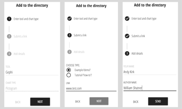
On the top left you will find the + button which offers a simple three-step process to allow contributors to suggest a link to either an example or tutorial of a chart being made by a specified tool. Multiple references are welcome for the same chart-tool combination but, inevitably, plugging the gaps as much as possible is a key goal, initially at least.
Submitted suggestions will be received on email and considered for inclusion, please don’t expect them to automatically appear in the directory. When it comes to sending suggestions for contributing references, the main appeal I would make is please don’t just dump a load of links on an email to me and instead use the submission process provided wherever possible.
If you have additional suggestions for tools to be added, please get in touch with details. Constructive and realistic suggestions for enhancements to the directory will always be well-received but I’m going to be fairly strict on only accepting compelling reasons for adding further chart types. Finally, if you feel a significant AKA has been missed please do let me know.


