In order to sprinkle some star dust into the contents of my book I’ve been doing a few interviews with various professionals from data visualisation and related fields. These people span the spectrum of industries, backgrounds, roles and perspectives. I gave each interviewee a selection of questions from which to choose six to respond. This latest interview is with Sarah Slobin, visual journalist & Things editor at Quartz. Thank you, Sarah!
Q1 | What is the single best piece of advice you have been given, have heard or have formed yourself that you would be keen to pass on to someone getting started in a data visualisation/infographics-related discipline?
A1 | Beware the asterisks. If you get all the way to the end of a project and you haven’t read it through thoroughly you may find yourself having to compensate for stray details that seems tiny but were in fact, major. (Read more)
Q2 | How do you mitigate the risk of drifting towards content creep (eg. trying to include more dimensions of a story or analysis than is necessary) and/or feature creep (eg. too many functions of interactivity)?
A2 | The best method for mitigating content creep has been to start with a clear list of requirements at the front-end of a project. This forces all parties to think through what the work the interactive is trying to do, create a list of priorities and, agree on them. The list is often more ambitious than we can accomplish, so end up with a clear sense of what can be cut from the bottom. This understanding – we can likely do X but not promise Y is very helpful at the 11th hour when the interactive takes shape and folks start to ask if we can add features. With the list we can look at what is possible and what has to be sacrificed. Something else that has been very useful is using this code-as-architect metaphor at the beginning of a project: ‘We need to think about the architecture at the front end. Imagine if you built a 3-storey Victorian House and then decided you’d like a modern, ranch house with huge glass windows. We’d to have to do an entire tear-down to reshape the infrastructure”
Q3 | If you had the time and resources (perhaps more skills, new tools) to revisit one project from your past and make improvements to certain features, which project would it be and what would you change?
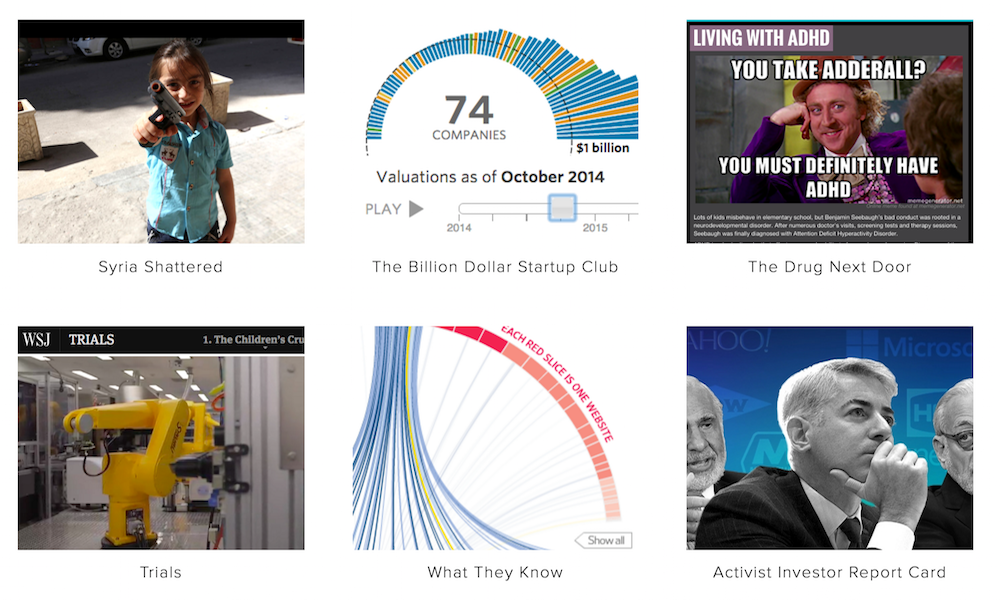
A3 | We did this immersive last year Syria Shattered, with photos and reported and user-generated video. We were working super hard to make a very heavy experience lightweight (so many videos and photos) but in the process didn’t work through our navigation structure well enough. Getting the technology right was super difficult. I was so bogged down with the story and the assets and building out the modules that I didn’t have bandwidth. My fear is enough folks didn’t stay for the entire narrative.
Q4 | What advice would you give to anyone working under the pressure of tight timescales: What are the compromises you are willing to make vs. those you are not? How do you juggle an ambition to innovate within the constraints you face?
A4 | I’m always the fool looking at the sky who falls off the cliff. In other words, i tend to seize on ideas because they’re exciting or innovating without thinking through the consequences of the amount of work they will entail. I find tight deadlines energizing. Answering the question of ‘what is the work the graphic/visualization trying to do’ is always helpful. At minimum the work needs to speak to this. Innovation doesn’t have to be a wholesale out-of-the box approach. Iterating on a previous idea, moving it forward is innovation. The Billion Dollar Start-Up Club is pretty straightforward. By adding an interesting visualization at the top it becomes innovation.
Q5 | We often hear how important ‘designing for an audience’ is but this is often easier said than done. How do you integrate this perspective of thinking into your own workflow? Do you have advice on any effective approach(es) you use for this?
A5 | The hardest thing to do is to listen to feedback when you’ve been crunching on a project for a long time. It’s super-important to show several people what you’re working on and get reactions. If you have more than one person saying ‘I missed that’ you have clear guidance that there is something you need to address. You can fool yourself into thinking you’ve found a solution for something if you’re working in a bubble.
Q6 | For a potentially multi-faceted story/subject, how do you arrive at a judgment of what will be the most interesting and relevant slice of analysis to focus on for a visualisation/infographic? What specific attribute of journalistic experience and skill do you think helps you to achieve this?
A6 | The interesting data usually floats to the top. You have to be able to look at superlatives and be ready to start over if you come up with a flat line. It’s important though, to be clear on which questions you want to ask from the data from the outset. This means you have to do some homework, know what has already been done and know enough about the data to interview it. It requires the discipline to do your homework, the ability to quiet down your brain and be honest about what is interesting and also a certain amount dogged persistence.
Header image taken from Sarah’s portfolio of work for the New York Times, Fortune and WSJ.

