Back in January I claimed that I would be hitting the new year with plans for more frequent, smaller blog posts to offer ‘some practical tidbits most probably relating to quite narrow design considerations’. That lasted for about a week, so its certainly long overdue that I pick this back up.
The small nugget of advice I want to share today is about the relationship between your data and your vision.
Whenever we start a visualisation task there will inevitably be ideas that form in your mind about what this thing might look like. It will be a mental slideshow of different imagery comprising keywords, colours and forms, metaphors, maybe cliches, things that you’ve seen before, things that have inspired you and things that you’ve maybe worked on before.
There is no ‘perfect’ in visualisation: there are better and worse solutions but no absolute path to perfection. It is therefore important to embrace these instinctive reactions we have to the subject and task we’re working on. These mental manifestations inject imagination and creativity into our work and this is important, without question.
However, our ideas only act as initial possible signposts and they should only play the role of background inspiration. They cannot be the leader. We can’t afford to commit ourself to such a narrow aperture in our thinking.
Our ideas are not the raw material, the data is.
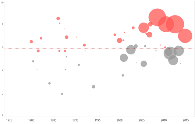
Take the example below. This is a piece I’m working on as a demonstration project to accompany the central workflow discussed in my upcoming book. The focus of the project is about the differing career stories of various movie stars. The tentative title is ‘Filmographics’ (that’s a clever wordplay combining films and infographics, in case you were wondering) and looks at the relationship between an actor’s career and the relative success of their movies in terms of critical reception and box office.
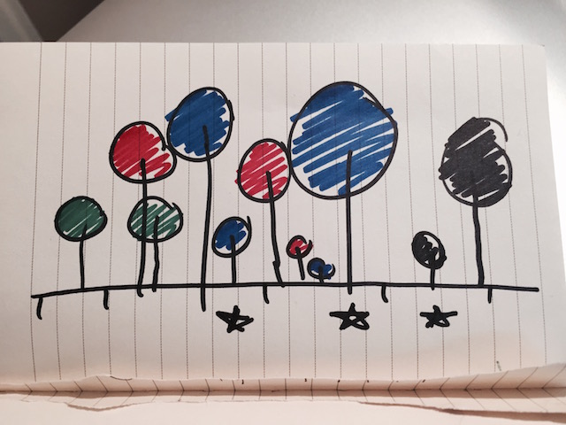
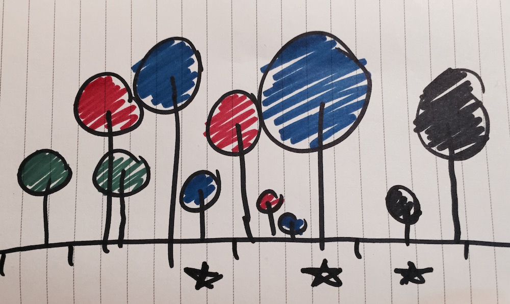
When I first had the idea, the very first image that formed was something like the sketch below, captured in my notebook on a particularly bouncy train journey back from London one evening. I had this vision of a forest of trees, with the height being the critical review, the size of the bubbles being the takings and the colours maybe representing the genre.

The reality, when using real data, was that a movie career is not organised in perfect intervals, with consistent reviews and takings: it is up and down, big and small, densely packed and then sparse. There are so many genres, and derivatives, that there aren’t enough colours to suitably distinguish each one. There are things from my initial idea that I can preserve going forward – and that in itself can be quite rare – but the initial idea of that neat forest was quickly shown up by the data to be redundant.

An important discipline you have to show as a data visualisation designer is NOT to be servant to just pursuing your initial idea (or even more starkly important, those of your client/customer). Early ideas and sparks of creativity are really valuable and, particularly as we become more experienced, our instincts are worth tapping in to. Just don’t be precious or stubborn, always maintain an open mind. Ultimately you need to be respectful to the shape, size and conversation emerging from your data. That is the true raw material.
“Good ideas are in abundance. We all have them. Implementations on the other hand, are not. I admire implementations far more than great ideas”, Julian Oliver

