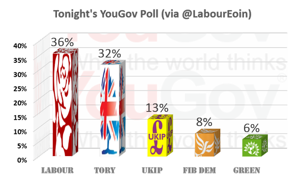
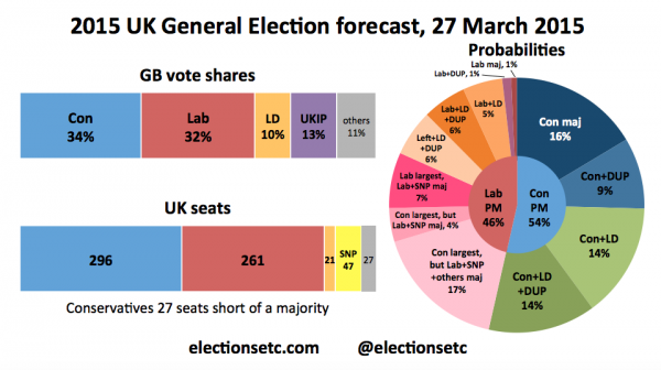
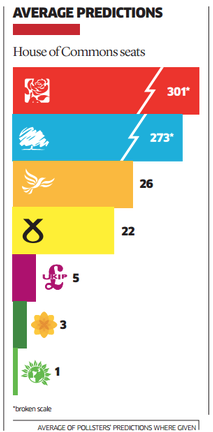
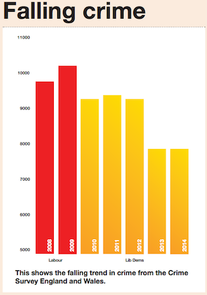
As we enter the final few weeks before the UK General Election on Thursday 7th May, I would be really keen to shine a finger-pointing light on any party who put their names to any manipulative and deceptive visuals.
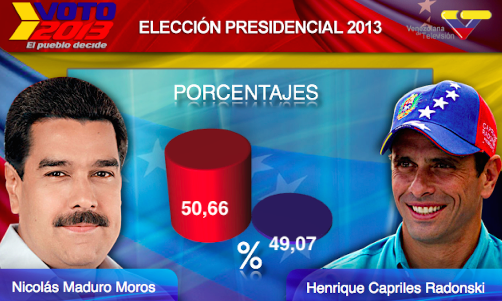
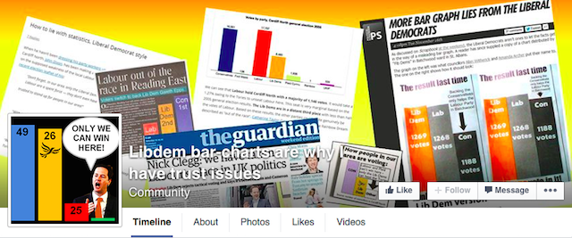
Yes, I know it is amazing to think that a political party might have a motive to use charts and graphics to deceive the electorate but it does happen. The featured image above is NOT from the UK (original link) but an illustration of the wonderful nonsense that can be published in the name of vanity and deception, from the 2013 Venezuelan elections. Here in the UK, there is a terrific Facebook page “Libdem bar-charts are why I have trust issues”
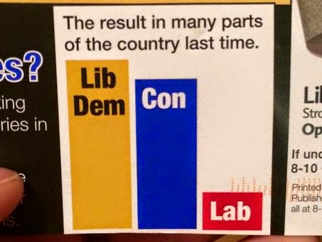
And a recent example curated on there but originally published on ‘Voting and Boating‘.
So if you come across any examples in the wild, in real life, on websites or on social media, please send them through and I will collate the best of the worst on here.
The good…
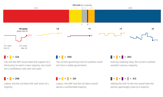
As an antidote to the bad allow me to point you in the direction of the good, this excellent collection of interactive graphics for Election 2015 by The Guardian graphics team.
The bad and the ugly
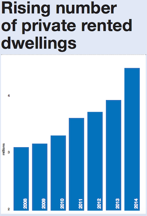
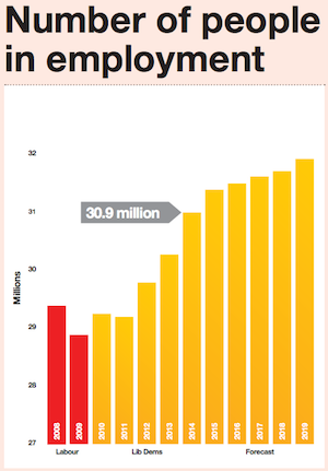
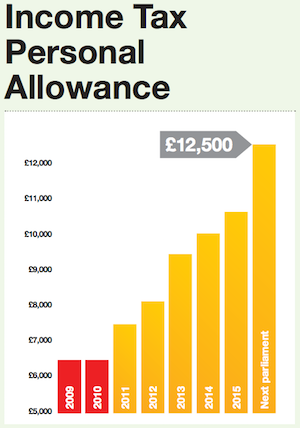
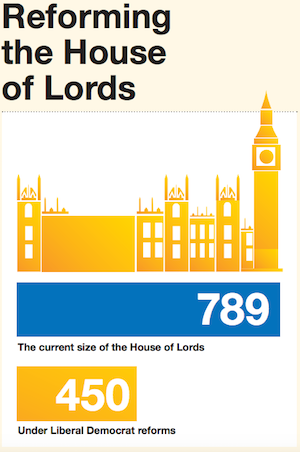
More Liberal Democrat chart crimes in their manifesto.
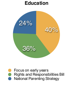
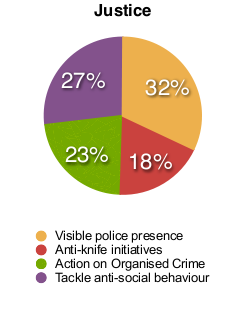
Some rather odd pie charts from the SNP’s website, not visually deceptive but odd numbers and odd analysis

