
Is it the visualisation or the data we like?
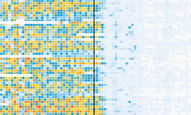
I’m musing about this visualisation work that has received a lot of love and attention on blogs and social media over the past few days. Created by the excellent people in the Wall Street Journal graphics team, it portrays data about the impact of vaccines in battling infectious diseases in the 20th Century.
Is it the visualisation or the data we like? Read More »