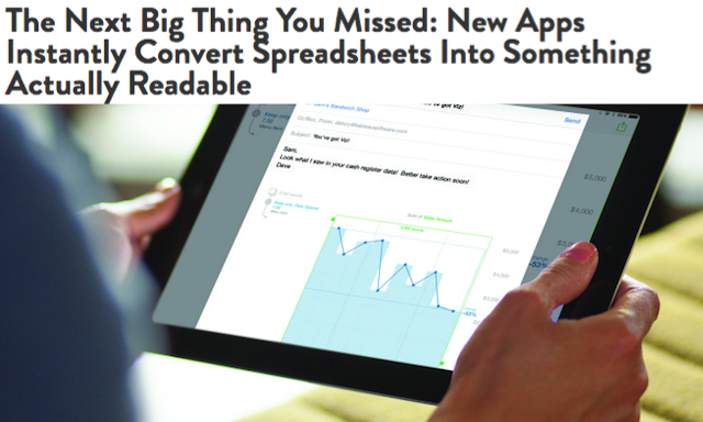
Last week there was an article on Wired profiling an upcoming tool from Tableau called Elastic, which drew my ire. The tool looks fine, haven’t seen a great deal about it but I’m sure it will find a user base.
What initially caused my Roger Moore eyebrow to spring into action was the way the article framed the tool. Check out this tweet from Wired.
“Spreadsheets are awful”. Just plain ignorance.
Spreadsheets are incredibly valuable tools for handling data, undertaking calculations and analysing it. They are not the most powerful of statistical analysis tools but they often provide enough. They are not the most potent charting packages, but they often provide enough. They are a fundamentally useful ally.
When someone emails a spreadsheet to your iPad, the app will open it up—but not as a series of rows and columns… The hope is that this will make is easier for anyone to read a digital spreadsheet—an age-old computer creation that’s still looks like Greek to so many people.
Sure, people do produce and share some really impenetrable workbooks. They dress up tables of data with the most horrendous shading and bordered decorations. However, as with bad PowerPoint slide decks, it is so lazy and easy to blame the tool and not the creator. What if I wanted the table of data un-visualised? Maybe I want to use the raw data as it comes, maybe I want to perform a lookup-and-reference type of interpretation? We don’t have to nor do we want to visualise everything. Let’s be more discerning than that.
That was the first thing. The second thing that caused my beef was the angle used to substantiate this type of tool as a kind of panacea that will automate and (that most dreadful of words) democratise the role of visual analysis.
So many companies aim to democratize access to online data, but for all the different data analysis tool out on the market, this is still the domain of experts — people schooled in the art of data analysis. These projects aim to put the democracy in democratize.
I don’t even know what that last bit means. Surely that would lead to democracytize?
These kind of confused articles bluntly reduce the craft of data visualisation, data science and data journalism into the most simplified of disciplines, something that an automaton should operate. They smooth over the complexities of working with data in a way that only existed in the idealised scenario offered by Microsoft’s practice ‘Northwind’ database.
The hope is anyone can become a kind of data scientist — using data in ways that echo so many journalists these days, from Nate Silver on down.
A “kind of data scientist”. “Nate Silver on down”. Wonderful, sign me up, I’m sold.
Finally, as Andy Cox pointed out, can we also please drop the Joey Tribbiani quotations wrapped around “visualize”.
The Seattle-based company has been massively successful selling software that helps big businesses “visualize” the massive amount of online data they generate


