I’ve had this issue on my mind for a while now but haven’t really found a way of expressing a cohesive post about it. I still haven’t, as you’ll find by the time you reach the bottom. Let me state from the outset: today, I am the problem guy, not the solution guy. However, I felt I’d pondered for long enough and so decided put this out there to trigger some further thought and discussion.
Digital preservation
As we will all know, the work emerging from the contemporary data visualisation field is dominated by digital output. Of course, there is still a significant amount produced for print consumption but, ever-increasingly, data visualisation is a digital – made-by and made-for – pursuit.
The history of the field preceding this recent era had a legacy of work that was easily archived and replicated for viewed in books or libraries. But how do we preserve the incredible array of digital data visualisation work being produced by this and future generations? It is an issue that goes beyond just safeguarding URLs and certainly goes beyond just the field of data visualisation.
Last evening, there was a terrifically astute stream of tweets from The Upshot’s Derek Willis, discussing web/data journalism, that articulated the concerns perfectly
Digital archiving
As I perused some of the many tremendous web-visualisations tracking the recent US mid-term elections I was struck by the fleeting status of a graphic being fed by live data updates as they occur. As the story of an election night unfolds there will be all sorts of interesting ebb and flows, different points where the story arc seems to be heading in different directions (maybe not in this particular election but you get the point).
As soon as the new data comes in, the composition and content of that live graphic has changed.
This is not unique to elections of course, any real-time or frequently updated visualisation.
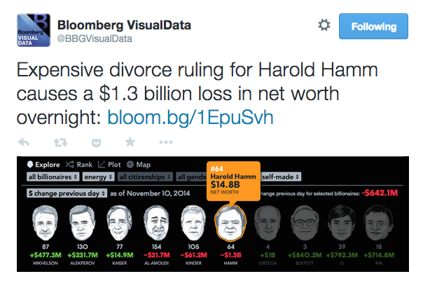
Over on Bloomberg they have the excellent Billionaires project, with a daily update on the fortunes (absolute and changing) of the world’s rich.
What is interesting about this project, as Lisa Strausfield discussed in Data Stories episode #41, is that Bloomberg has journalist resources assigned to stories around billionaires. It’s a matter of common interest and intrigue so why not. Perhaps because of this dedicated resource there is a daily archive of the status of the billionaire’s rankings project for any given date (eg. 11th April). So it is very easy to revisit a point in time and see how person x did on that day
Not every real time project will have that resource, nor will it have a subject matter that has levels of potential interest that endure on an ongoing basis. So what can be done for those projects?
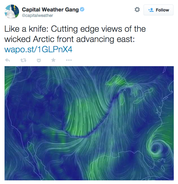
Another example of the preservation challenges. It sounds like soon (or even already) parts of the US will be getting very cold. I saw this tweet with a still snapshot of the live ‘Earth‘ weather map visualisation by Cameron Beccario.
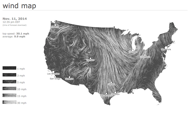
Seduced by these patterns I also took a look at the display on the hint.fm ‘Wind Map‘ and took my own screenshot to preserve that data ‘moment’.
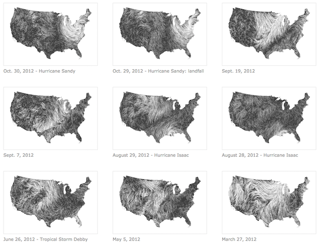
I’d forgotten that the Wind Map project does have an archive gallery of previously interesting or noteworthy weather events.
However, that gallery has not been updated since Hurricane Sandy in October 2012.As soon as this latest weather system passes, those interesting patterns are gone forever. Unless someone archives them.


