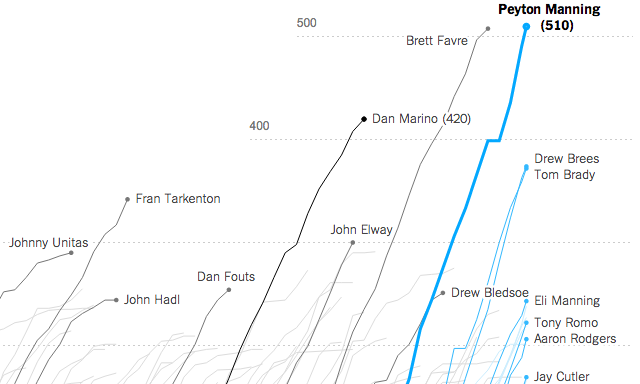
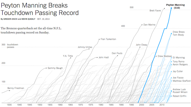
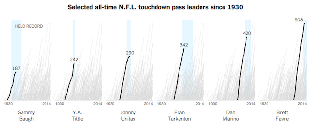
This weekend Gregor Aisch and Kevin Quealy published a great graphic for The Upshot that charts the record-breaking NFL touchdown passing achievements of Peyton Manning.
I’m not a knowledgable follower of American Football but as a sports fan in general I am fascinated to read about the history of the sport’s quarterbacks – the most quintessential of American sporting roles. Each line tells a rich story of a player’s career, its duration, the speed of ascent, their periods of high performance and decline in performance, the periods of injury, the eras of their dominance, the potential successors and predecessors holding the crown of top QB. A deep pool of liquid interpretative goodness, in other words.
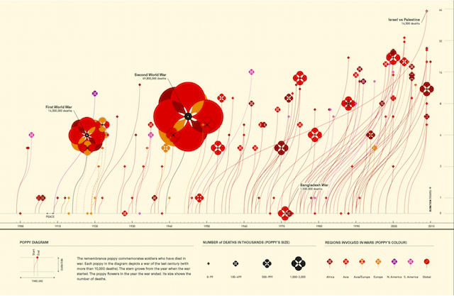
In concept terms, it reminds me a lot of a graphic called ‘Field of Commemoration‘ that I saw last year by Valentina D’Efilippo. Gregor also tweeted some examples of a few ancestors of this chart by the New York Times.
What these charts confirm is the compelling nature of time-based data visualisations. When we consider the buzz (and occasional noise) about ‘storytelling’ there is no more self-evident demonstration of this than through the portrayal of trends and changes over time.
On this note, in a few weeks’ time I will be taking to the stage at the Visualized.io conference in London. The tile of my proposed talk is ‘The Design of Time’ and my aim is to lay down an informative profile of different techniques for showing data over time. From the common to the rare, from the vintage to the contemporary, from static through interactive and to the animated: there’s so much to cover but I’m very open to receive recommendations of your particular favourites.
So, if you have a killer example of a time-based visualisation that has resonated with you then please send them over and I’ll seriously consider them for inclusion in my talk. The more unique the subject, the technique or the origin, the better! (I have only 20 minutes to work with so may not be able to accommodate all…)


