I’ve had this short post sat in my draft folder for weeks now, awaiting the right context before publishing. I’m finally motivated to post it having seen a few discussions on Twitter last week whilst on holiday (when the hotel pool has wifi, what can you do but look now and again…).
The Twitter discussions involved comments along the lines of “good, but would have been nice if…”. This is something I’ve uttered and written hundreds of times before: it is an inevitable reaction of somebody assessing what is in front of them. (Whisper it, sometimes it will also be a comment shared with the wider world to help others understand just how super astute you are!).
I didn’t bookmark the conversations nor is it about pinpointing individuals, indeed I can’t even remember who was involved. Furthermore, this isn’t another criticism-soapbox piece but a simple reminder that data visualisation – and frankly any creative endeavour – is a pursuit of optimisation.
Firstly, it is important to remember that the “it would have been nice if…” observation (usually in relation to absence of a certain design feature) is more than likely a view also shared by the creator. Just because a piece of work doesn’t include something that would have added value doesn’t necessarily mean that it wasn’t both considered and desired by the designer him/herself.
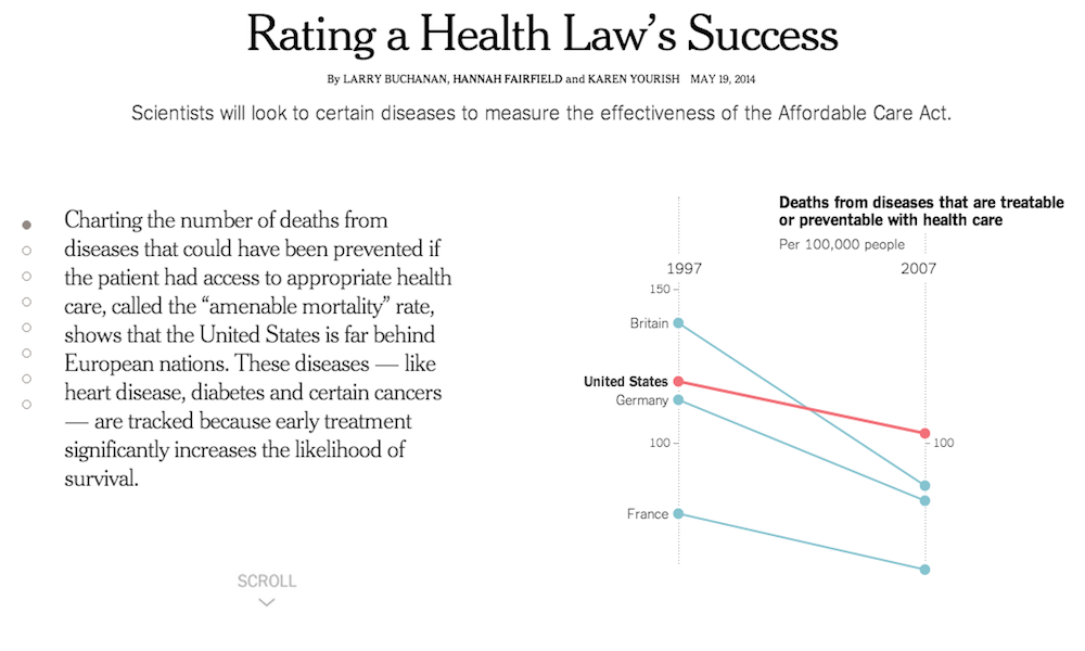
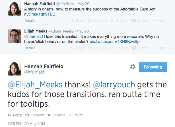
This short exchange between Elijah Meeks and Hannah Fairfield in relation to a New York Times graphic about the Affordable Care Act demonstrates the reality of the circumstances in which projects are created. I’m not picking on Elijah’s query – the hover/click feature was something I remember also instinctively wanting – because it was an entirely valid point, rather I’m struck by Hannah’s quick reply ‘ran outta time for tooltips’.
Secondly – and mainly – we rarely, if ever, have perfect conditions for creating visualisation work. It is a game of compromise shaped by factors like resource limitations, time constraints, client interference, format restrictions, market pressures etc. It is sometimes about the skill of judging when ‘good enough’ has been achieved. Indeed, on some occasions it is not even about settling for ‘second best’ but realising there is a viable path represented by a least worst solution.
So, don’t stop critiquing work and querying whether something had been considered. Don’t stop commenting on what you think would be good to make something even better. But do remember that there is likely a good reason why certain things couldn’t be achieved in the context of its creation.


