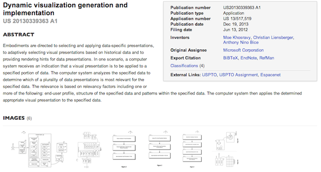
I was catching up with my January RSS feeds earlier and my attention was drawn to an unusual item that had been reeled in from a site called ‘4-traders‘. The article was titled ‘Microsoft Corporation: Patent Application Titled “Dynamic Visualization Generation and Implementation”‘ and contained a summary of the key claims of a patent filed by Microsoft Corporation in June 2012 but published on 19th December last year.
“Interesting”, I said, out loud but to nobody as I work alone. “I wonder what this is about?”, I queried, still alone. My curiosity had been piqued so I did some complex keyword-term digging (you might know it as a ‘Google’ search) and came across a copy of the the full patent document.
I’ve copied a chunk of the summary text…
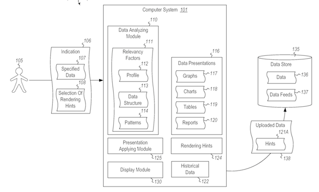
Embodiments described herein are directed to selecting and applying data-specific presentations, to adaptively selecting visual presentations based on historical data and to providing rendering hints for data presentations. In one embodiment, a computer system receives an indication that a visual presentation is to be applied to a specified portion of data. The computer system analyzes the specified data to determine which of a plurality of data presentations is most relevant for the specified data. The relevance is based on relevancy factors including one or more of the following: end-user profile, structure of the specified data and patterns within the specified data. The computer system then applies the determined appropriate visual presentation to the specified data.
In another embodiment, a computer system adaptively selects visual presentations based on historical data. The computer system analyzes prior visual presentation selections for specified sets of data and determines, based on which visual presentations were selected for the specified data sets, which visual presentations are most relevant for a currently selected data set. The relevance is based on relevancy factors including one or more of the following: end-user profile, structure of the specified data and patterns within the specified data. The computer system then applies the determined appropriate visual presentation to the currently selected data set.
In still another embodiment, a computer system provides rendering hints for data presentations. The computer system selects a portion of data for uploading to a data store and also selects rendering hints to be applied to the selected portion of data. The rendering hints indicate how the selected data is to be rendered in a visual presentation. The computer system then appends the selected rendering hints to the selected portion of data and uploads the selected portion of data and the appended rendering hints to the data store.
As you can gather, trying to make sense of the wading-through-treacle patent-speak is not a straightforward task but a summary of the summary leaves us with…
- A computer-implemented method for selecting and applying data-specific presentations
- A computer-implemented method for adaptively selecting visual presentations based on historical data
- A computer-implemented method for providing rendering hints for data presentations
On the surface it sounds like an attempt at a ‘smart’ chart type selection method, taking away some of the burden of thinking about what chart type is best from those who may not know. It also appears to be something along the lines of the Tableau ‘Show Me’ panel, where only chart types that are relevant to a given set of data variable types and quantities are proposed/available for usage.
However, it goes a bit further, with dynamic ‘relevancy factors’ informing the available and recommended presentation options. These factors are informed by a combination, ‘including one or more of the following: end-user profile, structure of the specified data and patterns within the specified data‘.
So what is ‘end-user profile’? Is this data based on a single users’ charting behaviour/preferences or maybe informed by patterns from a broader base of users (maybe all?) – akin to a “users who wanted to present this data tend to use this chart” concept? The answer seems to be the former…
The user’s profile may indicate certain preferences for visual presentations. For instance, the user’s profile may indicate a preference for tables for certain types of data, and a preference for reports for other types of data.
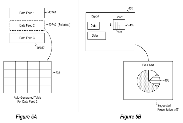
So how will it resolve conflicts between how users are deploying chart types vs. the correct way to use such charts? For example, if pie charts are constantly being used to represent time-based data, would the ‘system’ accept this as the user’s preference, despite this method demonstrating incorrect usage, and override the standard recommendations?
There is also mention of applying different ‘weights’ to “specified users, profiles or industries” when it comes to determining the appropriate visual presentation. Perhaps this means a corporate profile would have weight to establish certain protocols that its users would inherit in terms of the recommendations they receive?
The ‘hints’ element of the patent summary relates to a kind of preview mode, perhaps a pop-up indicating how the presentation will look if this is the chosen option.
The big question, that I can’t ascertain an answer to right now, is what is this ‘computer-implemented method’? Is it a new tool? Is it an extended capability to an existing tool (maybe Excel? PowerPivot)?
Anyway, just thought I’d flag this up, it will be interesting to see what emerges. You can view a pdf version of the filed patent on Google’s patent pages.


