I saw some nice techniques being used in this project developed by Derek Watkins and Laura Kurgan from the Spatial Information Design Lab at Columbia University.
The project has been developed to serve as a ‘launching pad’ for an ongoing investigation into the impact of Superstorm Sandy across the Tri-State region. Data generated by FEMA, the US Census Bureau and volunteers as well as photo imagery collected by the Civil Air Patrol have been brought together to help researchers at Columbia’s Graduate School of Architecture, Planning, and Preservation explore the implications of the storm.
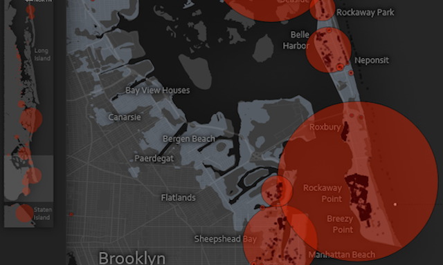
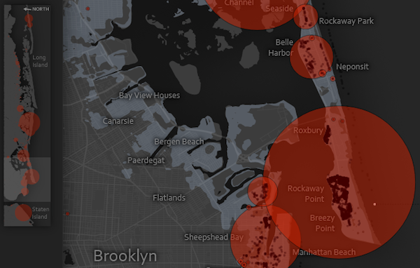
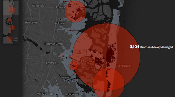
The project, in its current form, allows you to explore the amount of assessed damaged buildings up and down the coastal areas affected. You can see the worst hit areas through the size of the red circular areas. You can also see the extent of the storm surge, depicted by the light grey areas.
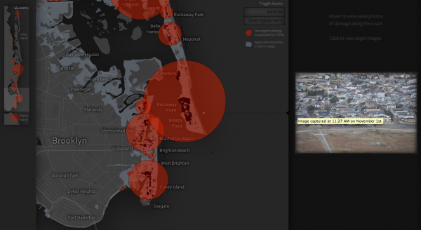
I particularly liked the interface and the way you scrolled up and down the coast, exploring the map in a vertical landscape. To accompany this is a small thumbnail insert on the left which gives you an overview of the land, highlighting the area you are currently focused on and also includes a preview of the data/bubbles.
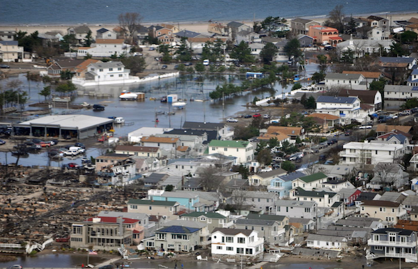
As you scroll down and hover your mouse on the right hand side you are able to view photos taken of the coastlines about 10 days after Sandy hit landfall, you can click on them for a larger image. The view for each photograph is pinpointed along the coastal map.
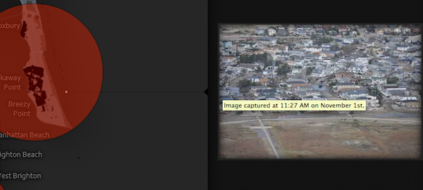
Whilst some people will understandably have a problem with the use of circle areas to encode the quantities of damaged buildings I think the use of opacity and hovering annotations compensates for the overlapping and distorting of the central point of reference.
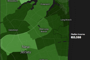
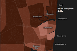
You can also toggle on/off details of income levels and unemployment levels to establish a sense of the circumstances for those people most impacted by the storm.
All in all a great looking project and I look forward to seeing it develop further layers of detail and analysis in due course.

