I would be surprised if many people out there have not heard of Alberto Cairo, given the vast amount of different channels and contexts through which he is active in the data visualisation field.
For the rest of you, Alberto is visible as the editor of ‘The Functional Art’ website/blog about data visualisation and infographic design, but that only scratches the surface of what he gets up to – I included Alberto in my round of up 2012 as one of the most important figures of the past 12 months and you can read more about him there.
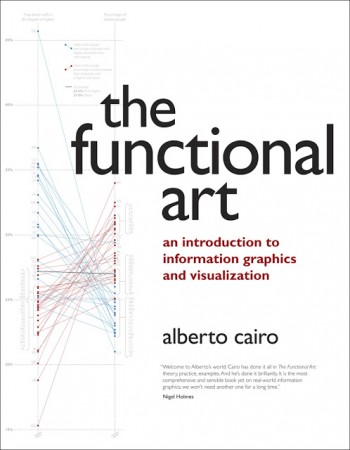
Anyway, a few months ago Alberto released an English version of his book ‘The Functional Art‘ which, as he describes, offers “an introduction to Information Graphics and Visualization, the communication of facts and data by means of charts, graphs, maps, and diagrams”. As a bonus, the book also included a DVD with 90 minutes of video lectures.
Having gratefully received a copy a couple of months ago it unfortunately landed at a busy time for me so this is the first chance I’ve had to read and review the book. With plenty of other insightful reflections already out there (1, 2, 3, 4, 5 and 6) I didn’t want to rehearse too much of what others have covered but I did want to offer a rather belated and brief personal review.
The first thing to say is that this is a super book. Let’s get that out there from the off. If Alberto was in school he’d definitely be running home proudly showing his parents the A1 he got from his teacher. You’d hope so too. To write a book in school is no mean feat.
I digress.
This book is very well written, extremely well-considered in its structure and sequence and covers so much ground without ever feeling too heavy or too laboured. Despite so much being covered, the book has room to breathe – you never feel things are rushed or corners are cut.
It is structured into four Parts, though it feels more like two distinct sections. Parts 1, 2 and 3 include nine chapters covering the Foundations, Cognition and Practice. Part 4 then changes gear and includes ten interviews with notable designers and practitioners from the field. Click here to see the chapter breakdown within each part.
When you read the book – and if you know or have met Alberto – you can’t help but hear him talking. It’s akin to an audio book without the audio. His personality and passion for the subject leaps from the page, maintains a momentum and keeps you turning the pages.
The clarity of his conviction is also very impressive but not stylistically ‘oppressive’ – this is no preacher’s book. The book has gravity in the sense that you feel you are in safe hands being guided through this subject by somebody who has the necessary depth, experience and knowledge to pull it off.
I really enjoyed the rhythm of the book in the sense that every major point or message is supported with a well-selected example (illustration or anecdote). This significantly helps readers to cement their understanding of what, let’s face it, can be fairly tricky things to wrap your head around sometimes.
Alberto also does a commendable job of creating a linear account of a non-linear, almost radial subject. Having faced this challenge with my own book I know how tricky this can be. I was pleasantly surprised by the theoretical depth in to which he explored issues of cognition and the tightrope that is the discussion about form and function.
Throughout the book you are reminded that Alberto is a journalist at heart and this is such a strong and important attribute. This informs some of the most important messages in the book, such as:
- Horses for courses – the importance of context is so pivotal in dictating what solution will work best for a given problem context
- Curiosity doesn’t kill the cat – there was repeated emphasis throughout the book on the importance of designers demonstrating curiosity and how this can be seen as a key attribute of success (this also emerged prominently from the interviews)
- Act like a reader, not a designer – this will help you to NOT treat readers/users like idiots
- In journalism, do not view infographics as a service or as a fancy accompaniment, see it as a vital and necessary part of the story-finding and -telling skillset
I won’t go in to much detail about the rest of the many take away insights I picked out the book, but some of the more prominent ‘sticky page markers’ were inserted for the following…
- Pg. 19 – Difference between figurative and non-figurative
- 19 – Visualisation as a technology
- 26 – What does the designer want me to do?
- 31 – Not just one way of encoding
- 37 – Think like a reader, not a designer
- 41 – Bubble diameters
- 51 – Wheel diagram
- 67 – Tufte vs. Holmes
- 97 to 142 – Great introduction/summary of the visual system (ties in value of Few and Ware, etc.)
- 111 onwards – Excellent treatment of cognition
- 123 – Perceptual tasks
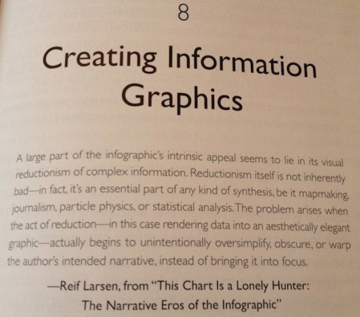
- 153 – Great quote (shown below)

I loved the interviews section at the end. It brought a really nice change in focus to round off the learning, with some excellent choices of key individuals to probe for their tidbits of wisdom. All are great but I felt a particular highlight was the interview with Juan Velasco and Fernando Baptista from National Geographic – the depth of research and preparatory work and the attention to detail that goes into their graphic work is mind-blowing.
To point out things that the book lacks is a redundant issue really. It fundamentally matches up to your expectations or hopes as something that offers a comprehensive treatment of the key aspects of this great field. It isn’t a “coffee table” glossy gallery, it isn’t a tutorial-laden “how-to” book, it is an “Introduction to Information Graphics and Visualization” – exactly as it sets out.
I don’t know this as fact, but I suspect Alberto has written a book that he would have valued himself down the years and I’m sure other infographic and visualisation designers now will find great value in it.
All in all, as I began, this is another super addition to the literature around this subject and really should find itself on your bookshelf (e- or otherwise). After all, anyone who can command respect and receive great reviews from people from (relatively or, at least, traditionally) diverse positions within the field, such as Stephen Few and Nigel Holmes, must be doing something right!
You can buy The Functional Art from the usual places such as Amazon and Barnes & Noble. On Alberto’s site, there is also the chance to download three chapters for free.


