To mark each mid-year and end-of-year milestone I take a reflective glance over the previous 6-month period in the data visualisation field and compile a collection of some of the most significant developments. These are the main projects, events, new sites, trends, personalities and general observations that have struck me as being important to help further the development of this field or are things I simply liked a great deal. Here’s the full compilation of all my collections.
Earlier this year I published this collection for the first 6 months of 2012 and now I’d like to mark the end of 2012 with my latest perspective. I look forward to hearing from you with suggestions for the developments you believe have been most significant.
And so, as ever, in no particular order…
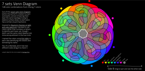
1. Santiago Ortiz
If there is one name that has dominated the design side of the field over these past few months it would have to be Santiago Ortiz. Not a week seems to have gone by when he hasn’t released a new awe-inspiring, mega-creative project, such as his 7 sets Venn Diagram or Lostalgic. What’s more, much of his work is based on complex subject matter, often highly computational, mathematical or qualitative in nature. An incredible few months for Santiago was topped off with a ‘people’s choice’ speakers slot at the Visualized conference where he received a fantastic standing ovation.
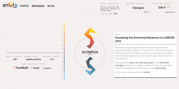
2. Emoto
There were of course many visualisation, graphic and art projects launched and associated with the London 2012 Olympics but Emoto, above all, really stood out as simply one of the most ambitious and multi-faceted projects seen in this field. A joint collaboration between Moritz Stefaner, Studio NAND, and Drew Hemment and the team at and around Future Everything, this project aimed to capture and visualise the excitement and talking points around the Games based on large extracts of Twitter data. This stream of sentiment about different aspects of the Olympics was visually broadcast during the games using an innovative origami-style object which swarmed across the screen as new messages were posted about different topics. The sentiment from this huge dataset was constantly analysed and the key results shared and discussed via a dedicated blog. At the end of the games a data sculpture was then created using 17 milled plates to exhibit the story of the sentiment around the games, one for each day, and an enormous wall-mounted timeline of the event in tweets. A truly staggering project and one that fundamentally succeeded.
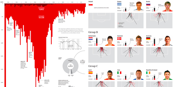
3. Simon Scarr
I’ve tweeted a few times about Simon whose work I first came across at the Malofiej 20 event. He is the Graphics director at The South China Morning Post and is responsible for some of the best static and infographic work I’ve seen this year. Naturally, the South China Morning Post doesn’t command the same visibility on this side of the world, in comparison to the New York Times or The Guardian, but Simon has started his own site to profile the work being published out there and I strongly recommend you go through his portfolio and follow his updates.
4. Training
This isn’t meant to be a cheap plug for my own training, rather an observation that more and more people seem to be seeking training courses in data visualisation and/or infographics. There appears to be a real appetite to learn about this subject now, perhaps a realisation that taste and instinct alone is not sufficient to create effective data visualisation work. Aside from my own training courses, as well as those of Stephen Few and Edward Tufte, many other one-off workshops and courses have been run (example 1, example 2). Beyond the classroom format, the highest profile offering has come in the shape of Alberto Cairo’s ‘Introduction to Data Visualization and Infographics’ MOOC (Massive Open Online Course) which was extremely successful, with 2000 sign-ups for the first edition, and is already/nearly booked up for the second being run in January. Read just one of the very positive reviews this course has received here. This is a very encouraging sign for the community, to see more and more practitioners wanting to educate themselves and enhance their skills can only be good news.
5. Alberto Cairo
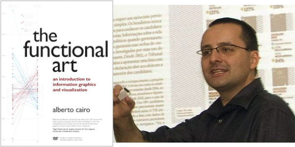
…and speaking of Alberto, this guy has been the busiest man in the field this year and deserves recognition for this. He has translated and launched the English version of his book ‘The Functional Art‘ (review coming soon when I’ve finished the last third!), he’s lecturing at the University of Miami, he’s designed and delivered the MOOC courses (and now facing another!), his quality and quantity of output on his blog is enough on its own, he’s one of the most active contributors on Twitter and he’s found time to be a peer reviewer on my book too. And he has a young child!
6. Better Infographics?
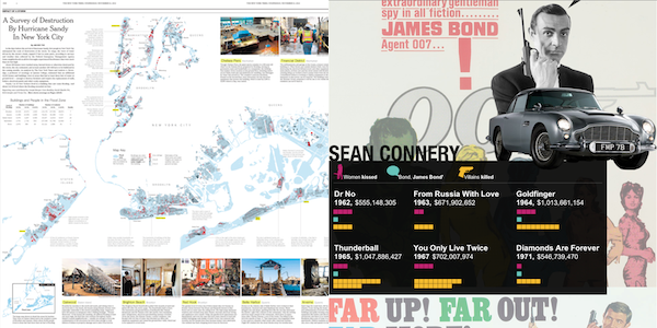
It seems 2012 was the year the flood of tower posters and generally bad infographics receded somewhat allowing the best work to be more visible. So, perhaps its less about better and more about easier access – less noise – but the infographics field seems a very different place than it did a year ago. We’ve seen some fantastic, authentic infographics this year from all the usual suspects (NYT, Washington Post). There were also some nice examples of interactive infographics from the BBC (James Bond) and this one about Water. From a personal viewpoint it was interesting to note that I had far fewer requests come in to publish infographics this year, maybe this has something to do with the impact of visual.ly offering a natural home for such work?
7. US Elections
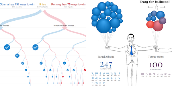
Aside from the Olympics, the biggest ‘data’ event this year was clearly the US elections and so every news outlet or political-related broadcast entity brought their own visual solutions. As you’d expect, the choropleth map has had to run off into the woods to hibernate for the winter having been pushed to an inch of its survival but we did see some really innovative works. Perhaps the most celebrated was the New York Time’s ingenious 512 Paths to the White House but there was also a lot of love for the Guardian US’s ‘balloons’ visualisation, as well as many others. Of course, it doesn’t need me to pick out the fact that Nate Silver was the undoubted star of the show and it will be fascinating to see what legacy his effect has on future US elections and those in other countries too.
8. Going beyond the visual…
One of the interesting things I’ve picked up on during the past few months has been the creativity and innovation of experimentation as some people look to go beyond solely the visual representation of data using computers or illustration. We’ve had the Data Cuisine Workshop, experiments such as Tasty Tweets, some fascinating work by Onformative looking at the fusion of dance, movement and sound. We also saw the fun pieces like Pumpkin Pie Charts and Binders full of Burgers. I’m also intrigued by the potential of Kate McLean’s sensory maps, mapping the smells, sounds and tastes of a city.
9. Dimensional changes in wood
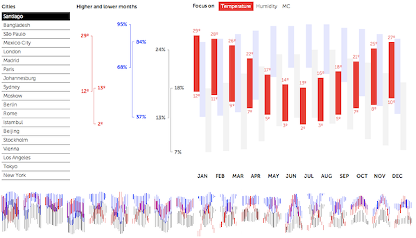
In theory, the temperature, humidity and dimensional changes of wood should be amongst the least accessible subjects (and frankly the more boring of topics) to the lay person but there is something so great about this project. It’s elegant, has slick transitions and packs in so much comparable information into a very small space without ever feeling cluttered or overwhelming. The small multiples at the bottom of each graphic are fantastic summary devices and the whole thing just fits together into a really smart piece of work that should offer a blueprint if not just inspiration for those of you looking to make scientific information accessible.
10. The Visualisation Community
[Group hug] Finally, I’m not alone in observing this but I do want to acknowledge what a terrific community the data visualisation and infographics world is. Maybe its because its an enjoyable and creative discipline but everyone is active, contributing and supporting each other with good humour and spirit. Twitter, in particular, is a very positive, accessible and welcoming community so if you’re not already on there, or are a silent observer, do get yourself involved because it is highly rewarding. So, hi-five to everybody on there because you’re a very nice bunch of people and thanks to all of you for making it a great field to be part of. [/Group hug]
Special mentions…
Here are the other developments that deserve a warm round of applause having just missed out on the main top 10 list:
Slopegraphs and Small Multiples – This is quite an instinctive sense more than anything concrete but I really have been struck by the number of times I’ve seen people discussing the use of Slopegraphs and Small Multiples. Maybe its because I’m a massive fan of both these approaches that I have a particularly radar for their mention but I do believe we are hearing more about them and that’s a good thing.
Tornado Tracker – This is a bit of cheat given it was published in May but I only saw it in July so that makes it ok, ok? This was a really super project to track, initially, 56 years of tornados across the US, but as the project gained plenty of eye-balls it developed into a number of further versions with more data, up-to-date stories and interactive versions.
Wind Map – We’ve all seen and played with the Wind Map and it wasn’t even launched during the past 6 months. However, that word ‘play’ matured to the term ‘use’ in recent months as powerful weather systems (Sandy, Isaac) battered parts of the US. People were actually using the visualisation (amongst others) to help them track the live story, which shows that works don’t just exist as artefacts – they are being utilitised.
Graphics Blogs – It was great to see the launch of dedicated gallery, collection and design narrative websites for both the Washington Post and National Geographic, both very important organisations in the world of visualisation and infographics.
NYT Olympics Series – Of course you can’t ignore the ongoing incredible work of the New York Times, which arguably moved up another level this year, particularly with the addition of Mike Bostock. The series of Olympics visualisations they did often within hours of the story or event happening were quite incredible with Joe Ward and Graham Roberts at the fore of the best stuff.
Visualized Conference – I’ve already spoken about this at length so I won’t rehearse the same points other than to say this was a fantastic two day event, packed full of inspirational and impressive talks and speakers and I sincerely hope it continues in 2013.
State of the Polar Bear – Finally, I often find myself included bear-related projects, but I loved this project that investigated the population and habitat of polar bears.


