After a frantic couple of weeks I have managed to submit an entry on time for the latest Visualizing.org data visualisation contest, this time around the London 2012 Olympics. This is an exploratory joint submission in collaboration with a friend of mine, a talented young chap by the name of Andrew Witherley, of whom I hope you’ll be hearing more of in the future.
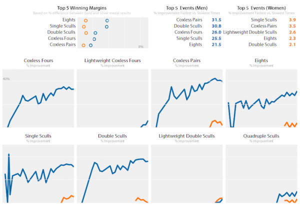
Entitled ‘The Pursuit of Faster‘, this design project explores the evolution of male and female medal winning performances across all Olympic Games since 1896.
It portrays the patterns of improvements in the results of time-based events where speed is the measure of success, whether it be on foot (track athletics), in water (swimming) or on water (rowing and canoeing). By choosing a sport and selecting an event you can see how Gold, Silver and Bronze winning times have changed over the years, for both men and women, as they strive for that ultimate pursuit of being faster than the rest.
You can also access a range of summary analysis and visuals to compare the % improvements of medal-winning times, see which events have witnessed the largest improvements and how these patterns compare between men and women, which countries have won most medals for each event and what the largest winning margins were.
The purpose of this visualisation is to consider how enhancements in coaching, technology, fitness, training, physique and sports science in general have influenced the improvements in performances? How much closer are women to reaching the performance levels of men? How much faster do the trends suggest athletes can go?
I will be posting some more detailed narrative and explanation to go alongside this project, but in the meantime you can explore it here.


