To mark each mid-year and end-of-year milestone I take a reflective glance over the previous 6-month period in the data visualisation field and compile a collection of some of the most significant developments. These are the main projects, events, new sites, trends, personalities and general observations that have struck me as being important to help further the development of this field or are things I simply liked a great deal. Here’s the full compilation of all my collections.
At the end of December I published a collection for the last 6 months of 2011 and now I’d like to reflect on the opening 6 months of 2012. I look forward to hearing from you with suggestions for the developments you believe have been most significant.
And so, as before, in no particular order…
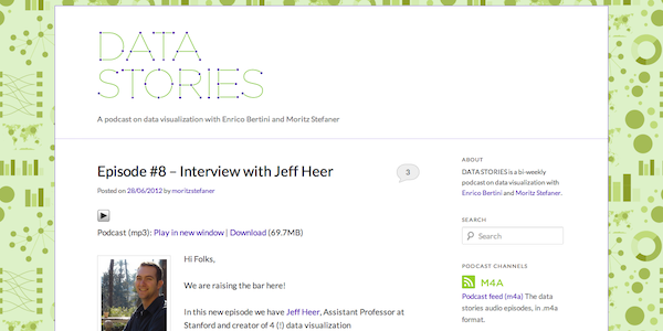
1. Data Stories Podcast
Actually, I say in no particular order but the launch of the Data Stories bi-weekly (if they manage it!) podcast from Enrico Bertini and Moritz Stefaner would be near the very top of my list if I was pushed to present a rank. As a honoured guest on two of the podcasts, I fully appreciate that a lot of work goes into the preparation, recording and publishing of these entertaining broadcasts. Despite being many miles apart the exchanges are wonderfully natural and the variety of subjects covered provide listeners of all levels with a great insights. The bar has been raised with the quality of recent guests (episodes 6 onwards) and we all look forward to the many enlightening discussion that await.
2. The Growing D3 Community
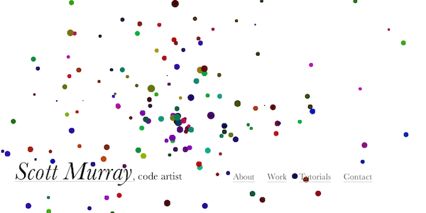
This time last year I acknowledged the significance of the development and launch of D3 as a landmark moment and 12 months on it is clear to see the rapid take-up, exposure and demonstration of great applications for its use. I now want to recognise the support community that has grown up around it. I have picked out Scott Murray’s excellent series of tutorials on his Aligned Left website but I would also recognise people like Jim Vallandingham, Jerome Cukier, Jason Davies and, of course, Mike Bostock himself with the expansion and enhancement of the tutorial/D3 wiki pages. We have also now seen the first book on D3 being released, with Mike Dewar’s ‘Getting Started with D3‘ just out and Scott has also announced a forthcoming book which will be based on an expanded version of his tutorials. Mike Dewar also did a great talk about taking the first steps in D3 at the New York Open Statistical Programming Meetup in January. Hopefully Mr Bostock’s upcoming move to the New York Times will only enhance the profile of D3 and further allow this encouraging maturing of a sustainable support community.
3. Malofiej 20
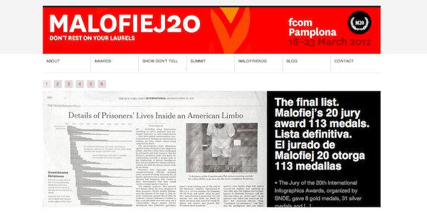
I’ve already covered at length my experiences at Malofiej 20, the Infographics World Summit held in Pamplona, Spain every March. As I said at the time – and maintain these months later – I thought this was a truly wonderful experience and I urge anybody who is fortunate to attend as a delegate or as a judge and speaker to grab the opportunity. It has opened my eyes to a great deal, especially about infographics in their purist form, the world of data driven journalism and the exceptional talents (for example: Bryan Christie, Carl DeTorres and Nigel Holmes, but many more) around this field.
4. Particle Flow Visualisations
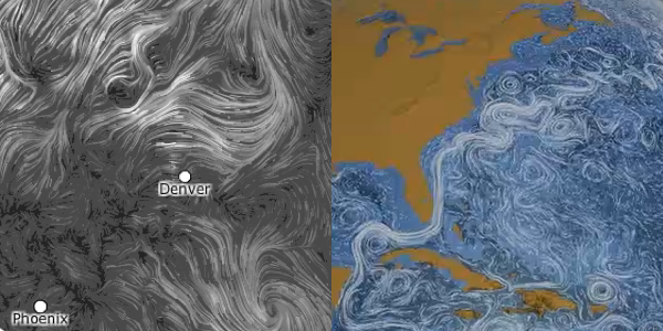
The past 6 months has seen a flurry of stunning ‘particle flow’ visualisation developments, demonstrating the innovation that is taking place, not just technically but also conceptually. We’ve had the Wind project from Fernanda Viegas and Martin Wattenberg’s (under hint.fm), Stephan Thiel and Moritz Stefaner’s fascinating Tyne visualisation, the beautiful Drawing Water project from David Wicks, the remarkable Perceptual Ocean created by NASA (watch out for NASA’s increasingly fascinating visualisation output), and some exceptional graphics in the Dynamic Earth gallery of videos.
5. The Guardian’s ‘Gay Rights in the US’
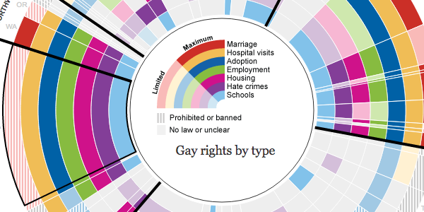
Back in May, when Barack Obama announced his stance on same-sex marriage, the Guardian in America Interactive Team developed a fascinating exploratory design which allowed users to explore the different gay rights issues state by state and to follow trends by region. Whilst there are some problems with radial layouts in terms of readability and slight visual distortion (some constructive critique here from Bryan Connor), nevertheless this piece created a very attractive and engaging interface for this important issue and brought out some stark issues to the attention of a large audience.
6. Kartograph
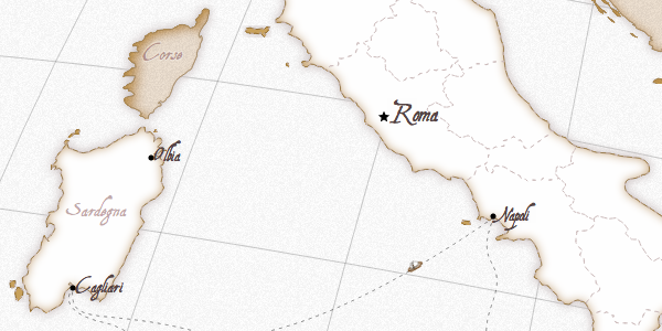
In my previous ’10 significant’ post I pointed out the emergence of Gregor Aisch as one of the key designers practicing in the field right now. This trajectory has continued so far during 2012 and has been most notable for his development of Kartograph, a ‘new framework for building interactive map applications without Google Maps or any other mapping service’. As Gregor outlined, the motivation for creating this was to serve the needs of designers and data journalists. Even though it is still in an early-release state do check out the showcase for a demonstration of what it can and could offer. The development of Kartograph and further interesting new work from the folks at Stamen signals a new era of creative mapping opportunities.
7. Kevin Quealy’s Charts’n’things site
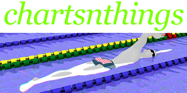
It has been another very strong period for the rightly celebrated New York Times graphics department and with Mike Bostock joining, Hannah Fairfield returning one can only expect a continuation of the same. I could have picked out many facets of their work over the past few months for this item but I decided to choose something a little less obvious perhaps. Launched towards the end of 2011, Kevin Quealy, a Graphics Editor at the NYT, uses his ‘Chartsnthings‘ Tumblr to share some of the many fascinating design process narratives that come from behind the scenes in the Graphics Department. I recently attempted to identify some of the secret’s behind the NYT’s success but one of the things I neglected was the openness with which they share their process, ideas and working practices. Kevin’s enlightening series of posts, based on graphics he and his colleagues have worked on, provides some fantastic fly-on-the-wall insight into these working processes, the decisions they make and the options they reject along the way. It is now an absolute must-read site and one of my very favourites. You can also catch Kevin on this great video of a talk he gave at the Walker Art Center, Minneapolis in March 2011.
8. Data Journalism Handbook
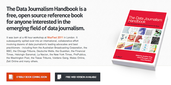
The development of the Data Journalism Handbook is a highly valuable and timely publication, coming out of a joint initiative between the European Journalism Centre and the Open Knowledge Foundation. Its inclusion on this list is predominanlty because of the hugely impressive and rapid process of creation. Featuring a collaboration of contributions from over 70 of the leading global voices of authority, it was released only 6 months after its conception. I’ve not read it cover to cover but the chapters I have been through were excellent pieces and I would urge anyone who has an interest in this burgeoning field to take a read of the free web version or look out for the O’Reilly e-book and printed book.
9. Sports Visualisation
Unlike the rest of the developments listed above, the inclusion of this item was originally intended to mark the lack of progress. As a keen follower of sports, especially football, I often find myself frustrated by the inconsistency of quality and absence of innovation in much of the graphics I see, not just in broadcasts but also in the print and interactive visualisations that cover and analyse these sports. Whilst we do see the occasional examples of fantastic visualisation, this feels like more an exception than the rule. Indeed, at Malofiej, there was a fair consensus amongst the judging panel that the sports category was probably the weakest of all. And it is a surprise and a shame because the data that is being captured and made available about sports is being enhanced at incredible rates. Thankfully, right at the end of the month, I have been given reason to feel hopeful having read this magnificent article by Max Gadney which presents some of the innovations around in-screen graphics. Hopefully over the next 6 months we can see some further improvements across the entire spectrum of visual formats and channels around sport.
10. BBC Visual Journalism unit
Finally, I leave with a very late entry to this list, something which has once again come to my attention at the end of the month, but hopefully a development we will look back on as a significant in due course. For many years I have felt the BBC has somewhat punched beneath its weight. It has so much resource, so much creativity, so many amazing talents, an incredibly well-respected journalistic tradition and yet has never really, sufficiently translated this into the innovation, variety and impact of its visualisation or infographic output. To be fair it has created a couple of the most shared and utilised interactive projects of late – the 7 billion people and the global pay scale pieces – but in (unfair) contrast to the likes of the New York Times, it has never fulfilled its potential. Hopefully, that is about to change with the news of the creation of the Visual Journalism Unit, a single entity to pool talent and coordinate all visual journalism efforts. This will be led by Amanda Farnsworth who, as Editor of Visual Journalism, will take the responsibility after the Paralympics for moving the beeb forward on the visualisation front and hopefully help to realise its incredible potential. Watch this space…
Special mentions…
Having struggled (again) to whittle this collection down to an easy and obvious top 10, here are the other developments that deserve a brief special mention having just missed out on the main list:
Bear 71 – A moving interactive documentary, blending data, visualisation and video to tell the story of a grizzly bear whose movements were monitored between 2001 and 2009.
Manuel Lima’s talk – A beautifully illustrated and animated rendering of Manuel’s talk at the Royal Society of Arts (London) in December 2011.
New Tools – There have been a number of new tools/resources released (Quadrigram, Miso project, Datawrapper) and promised for release (PolyChart, Plot.io) which only enhance the field’s opportunities.
Periscopic – Last but not least, I would acknowledge Periscopic as probably the visualisation agency of the year so far (and extending back to late 2011) – they’ve been involved in many high profile projects and hope they continue creating fantastic work throughout the rest of the year!

