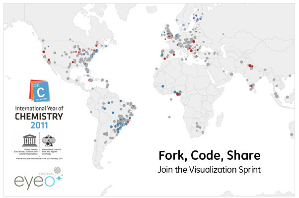
If there is one thing dominating the lips, or at least typing fingers, of data visualisation followers this week it is contests. I’ve already briefly mentioned in my last post the Data Stories podcast discussion about contests and awards, and this evening Twitter timelines are collectively shaking their fists in reaction to the latest Information is Beautiful Awards. Hot on the heels of this, this evening, details have been announced about Visualizing.org’s fascinating experimental project called the ‘Sprint‘.
The Sprint is an experiment in collaborative data visualisation whereby the community work together to visualise a set of data. Starting from an initial concept design, anyone is able to take the development forward by modifying and enhancing the code in all sorts of different directions, whether large or small (eg. colour scheme, encoding choice etc.). Eventually the design will evolve into a finished collaborative visualisation. As well as contributing to design changes the community can also participate through voting, evaluating and discussing what changes have worked or otherwise.
The first project involves a dataset from Global Water Experiment involving over 75,000 students in 80 countries collecting and recording water quality samples from their neighbourhoods. The challenge is for the community to arrive at a finished solution by March 22 which coincides with World Water Day. Every person participating will be credited on the final piece and a random person will be selected from all who contributed to win a free pass to this year’s sold out Eyeo Festival.
I will be really interested to see how this develops because it sounds like a great, innovative way forward for the field. How will design changes be received? Will it be possible to achieve consensus? Can the community work collaboratively like this? We’ll have to watch and find out…

