A couple of weeks ago Tableau announced the launch of version 7.0 of their popular Business Intelligence and Visual Analytics software. To find out more about this development I invited Craig Bloodworth, a Tableau evangelist and consultant for The Information Lab (a Tableau silver partner) to highlight some of the new data visualisation features and enhancements.
With their recently released version 7 Tableau Software have bought the data visualisation community a whole host of capability. While the team at Tableau are looking to invest $200m over the coming years in software R&D they aren’t against giving back to the community. As such the latest version of Tableau is always available for free in the form of Tableau Public for analysing and publishing public data. With that in mind let’s take a look at the great new features available in 7.
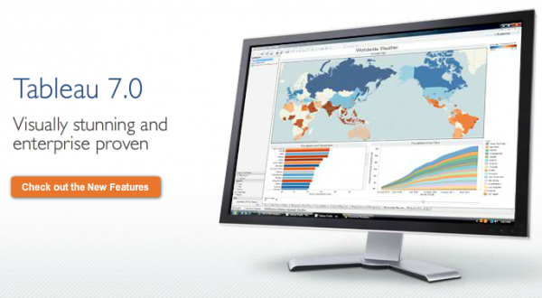
Much of what drives feature development is feedback from Tableau’s own customers and two of the most requested features, area charts and filled maps, can now be found in 7. What’s amazing about Tableau’s development strategy though is just how much work goes in to ensuring user interactions are intuitive in both building and consuming visualisations. This also applies to mapping where Tableau now even gone one step further than Google Local allowing panning 360⁰ around the globe allowing you to show Japan alongside North America (i.e. how they actually are). Maps will even auto centre on the region of greatest data density meaning, sadly, the UK may no longer be the centre of the world.
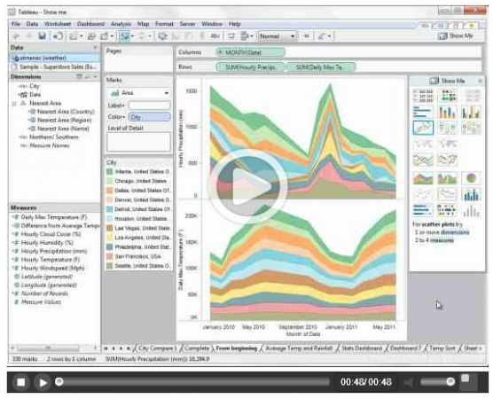
Outside of chart types v7 has revamped its unique ‘Show Me!’ function. If you’re still comparing Show Me! to Excel’s chart wizard or are expecting the library of charts available to have doubled then be sure to read my blog post on the matter. By moving Show Me! to a floating window you’re able to see exactly what choosing that extra dimension or measure will do to your chart. Tableau keep getting better on their promise of a single paradigm interface, allowing you to maintain focus on the analysis while switching between chart types can be done in a single click.
For people who’ve used or interested in Tableau Server the latest version is a complete game changer. Not only does it maintain its role as a publishing repository for sharing interactive visualisations around an organisation in an instant, for consumption via a web browser or mobile device, but its new data engine transforms it into a portal for all your live and static datasets. Think of it as a library of every data connection you’ll need without worrying about drivers, ports, server addressing, etc. What’s great is distributing your latest data model update to everyone in your team is as simple as pressing ‘publish’. No more shared network folders or complex version control, Tableau Server handles updates and distributes to all data users as needed.
While those are the main updates there’s just no time to also detail 1-click sort, tooltip improvements, menu reorganisation, connections to Hadoop hive & VectorWise, ODBC improvements, continuous dates, server high availability and multi tenancy.
Instead why not download Tableau Public or a trial of Tableau Desktop and try everything out for yourself?
If you’re interested in chatting to Craig about Tableau or getting the best from your company’s data feel free to email him craig.bloodworth@theinformationlab.co.uk.


