To reflect on a particularly volatile past 12 months economically-speaking, the BBC has published a collection of graphs nominated by some of the top economists around the world as being “the graph which had the greatest impact on them, which they thought best explains the current financial situation, or which tells us something significant about what lies ahead”. Accompanying each graph in the slide show is a description from the economists explaining their choices.
It’s really interesting to see the array of designs that have had such an impact on these influential people, who are making such important policy decisions on the back of these displays (amongst other things, of course).
I know their selections are going to be based on the stories each chart tells (rather than a judgment of its accordance with best visualisation practices) but it is still amazing to see so many examples of poor colour choices, ugly type and, above all else, dominating, intruding chart apparatus.
Here’s a small sample of the chosen graphs, you can see the full slideshow here:
VICKY PRYCE, SENIOR MANAGING DIRECTOR FTI CONSULTING

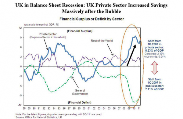
RICHARD KOO, CHIEF ECONOMIST AT THE NOMURA RESEARCH INSTITUTE

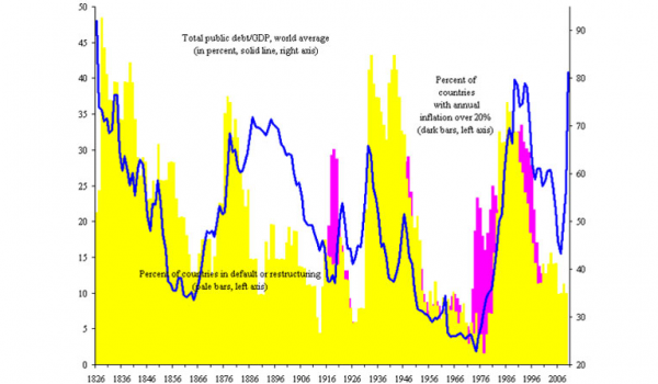
KENNETH ROGOFF, FORMER CHIEF ECONOMIST AT THE IMF

