To mark each mid-year and end-of-year milestone I take a reflective glance over the previous 6-month period in the data visualisation field and compile a collection of some of the most significant developments. These are the main projects, events, new sites, trends, personalities and general observations that have struck me as being important to help further the development of this field or are things I simply liked a great deal. Here’s the full compilation of all my collections.
Back in July I published a collection of the 10 most significant visualisation developments from the first half of 2011. As we prepare to bid farewell to 2011 I am now looking back over the latter half of the year with a follow up collection of developments that I perceive to have had most significance during the period July to December.
And so, in no particular order…
1. “We’re hiring!” – The increasing prevalence of data visualisation careers

Within the context of the worst economic conditions in many generations, data visualisation not only seems to be bucking the trend but actually continues to thrive against the odds. Over the past few years we have seen the field move from the fringes to become an increasingly mainstream discipline and this is being reflected in what I perceive to be a steady increase in prevalence of attractive jobs, postings and project opportunities in organisations and visualisation agencies for people with the key skills and knowledge. In recent times we have seen openings with David McCandless, Periscopic, Twitter and Interactive things, to name but a few. Data science in particular keeps being discussed as an emerging discipline and there is clearly a much better understanding about the value of these roles within businesses and organisations. There is perhaps one aspect which will hopefully see significant progress during 2012. Nathan’s FlowingData jobs forum is an excellent stream of opportunities both for postings and projects, and there are always avenues to pursue via LinkedIn, however, otherwise there is still much demand for a better established data visualisation B2B marketplace to connect designers and consultants with the businesses out there who are clearly, increasingly interested in this activity.
2. The relentless stream of amazing online content
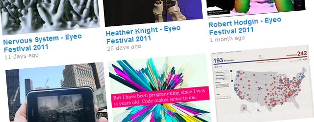
One of the trends I’ve been increasingly aware of during 2011, in general, but specifically the latter six months, has been the incredible, increasing volume of magnificent content available across the web. As visitors to this site will know, I compile a monthly collection of the best data visualisation content I find during the previous month. I have found the size of this task has grown considerably and I seem to save or bookmark a greater volume of superb material month-on-month, meaning I now need to present my collection over two posts to make it remotely digestible. I have been especially blown away by the relentless stream of inspirational video content with so many hours-worth of invaluable footage of leading practitioners discussing great projects or imparting their considerable wisdom. Examples would be conferences such as the O’Reilly Strata and the Eyeo Festival which captured, compiled and shared superb collections of speakers. There is, of course, always something amazing worth watching on TED and you should check out Benjamin’s excellently curated vimeo channel, with around 350 videos available.
3. The rise of the ‘Truth and Beauty Operator’

It would difficult to argue against Moritz Stefaner being recognised as the most prolific, prominent and celebrated visualisation designer of 2011. I included his OECD Better Life Index project on my previous ‘significant developments‘ post (which also received the gold seal of approval from Stephen Few!) and since then we have seen a number of great projects from or involving Moritz, such as the World Economic Forum Global Agenda Survey and the Max Planck Research Networks project. On top of that, in one of my favourite blog posts of the year, he generously shared his thoughts about ‘How to Become a Data Visualization Freelancer‘ in an interview with Enrico Bertini. He has probably done more speaking events this year than Al Gore and you can now read his thoughts in this recent interview with Benjamin Wiederkehr for the excellent Substratum series. Putting my forecasters hat on, and maintaining the European theme, my tip(s) for the next 6 months would be that Gregor Aisch or Jan Willem Tulp will occupy one of these top 10 spots…
4. Some great new titles on the bookshelf
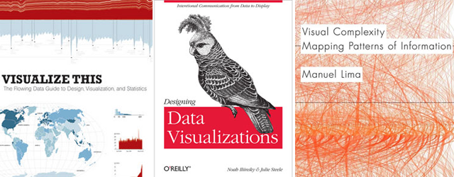
The second half of 2011 was decorated by the release of several important data visualisation books, including Nathan Yau’s ‘Visualize This’ (my review here), Noah Iliinsky and Julie Steele’s ‘Designing Data Visualizations‘ (review coming soon) and Manuel Lima’s ‘Visual Complexity‘ (review coming soon). News has also just reached me that the Guardian datastore is publishing an e-book about its work in time for Christmas so that’s another to look forward to. If you want something a little bit different, and harmless infographics is your thing, then the Lonely Planet’s ‘How to Land a Jumbo Jet‘ book of travel-related visualisations has now also been published. With regards to 2012, news that Tamara Munzner is working on a book (preview chapters) is great news and I really look forward to reading that, as I do the English translation of Alberto Cairo’s El Arte Functional, due next summer.
5. Forbes American Migration
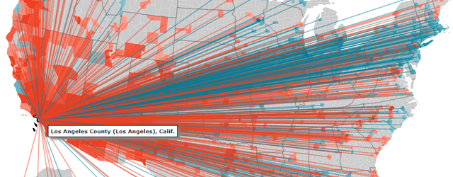
Published in November, this interactive map, created by Jon Bruner for Forbes, illustrated the patterns of migration within the US – involving almost 40 million Americans annually – by tracing the movement between each county over a 5 year period. As Bruner observes, this piece reflects the shifting “geographical marketplace of the States during the boom and bust of the last decade”. Based on IRS data, the selection of a county will display all the migration connections with other counties: those coloured blue send more migrants to the selected county; those in red take more than they send. The connecting arrows were perhaps somewhat redundant (in certain situations, like LA, they hide the county detail) but I found it an incredibly engaging solution, one that lured me into spend a significant amount of time interacting with it. The site’s social media metrics suggest many people have explored the data and reveals that this interactive has successfully made the subject matter accessible to all, allowing people to unlock the myriad stories that exist about this period of American social and economic history. I also appreciated the accompanying narratives from several writers who offered their expert perspectives on the key insights.
6. Hurricane Irene trackers – New York Times & Stamen
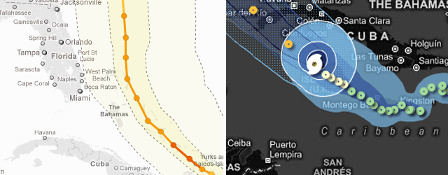
Towards the end of August, the focus of much news coverage across the western world was on the imminent Hollywood-esque arrival of the powerful Hurricane Irene along the east coast of the US. The main angle of media attention concerned its potential threat and impact on densely populated areas such as New York City. There were two prominent live visualisations used to track the progress of the hurricane, one developed by Stamen for MSNBC and the other for New York Times by the usual suspects Matthew Bloch, Shan Carter and Matthew Ericson. I couldn’t split the two so decided to include both, especially as I feel the context of these tools and the story overall reflected the growing maturity of the visualisation discipline. Not only were they deployed so prominently in the coverage of this developing story (as opposed to a post-event analysis) but both of these red-hot graphics groups were capable of successfully mobilising wonderfully effective, informative and elegant visualisation solutions in limited time.
7. Occupy George

“By circulating dollar bills stamped with fact-based infographics, Occupy George informs the public of America’s daunting economic disparity one bill at a time”. A very straightforward application of visualisation but one that seemed to strike a real chord with the sentiment of those involved or sympathetic to the Occupy movement, whether active or passive. The idea was that people could download the templates of various dollar bill infographics and then print them to use as props in the various protest movements that were spreading across the globe.
8. Are we learning to get along better?

A few articles over the past 6 months seems to encapsulate the sense I’ve picked up on that we might be learning to live more cordially alongside one another. By that, I mean infographics people and data visualisation people, pragmatic visualisation people and aesthetic visualisation people. In one of my favourite posts of the year, Zach Gemignani observed the relationship between artists and practitioners in data visualisation and rationalised how they can and should co-exist in a healthy discipline. Jorge Camoes added to this theme with an interesting piece about how one person can find and experience patterns that the next person may not, it is a truly individual experience. Enrico Bertini discussed how we should seek to help and advise infographic designers, in whose work we may identify significant flaws, rather than just dismiss or discount their contributions. Nathan discussed how we should come to acknowledge the important in the visualisation eco-system of low quality infographics and rather than chase them out of town, we should worry more if they start to disappear (in fact, maybe we should just come clean and confess our love for them). Finally, in a slightly different context, Robert Kosara made the observation from the VisWeek conference that visualisation was ‘growing up’ and had demonstrated evidence of it actually working (!). Without this sort of real-world evidence, and continuing attempts to define and clarify the different roles of visualisation, we would continue to be treading water and doing battle with one another, allowing the traditional fault lines to dominate coverage of the subject. Instead, I think we’re starting to see some real shape and harmony forming. Now, who fancies a group hug?
9. So many great, animated geospatial visualisations
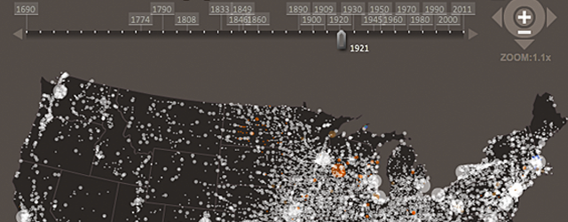
I wrote at length about the power of animated geospatial visualisations in telling stories my O’Reilly Radar piece and it is fair to say that the latter half of 2011 has been notable for a number of fantastic exhibitions of this popular method, including, but not limited to: Derek Watkins’ visualisation of US post office expansion, the Stanford visualisation of the spread of newspapers across the US, Mahir Yavuz’s ‘Sense of Patterns‘, NASA’s Visual Tour of Earth’s Fires and Michael Kriel’s iPhone movement project.
10. The launch of Visual.ly
The most high profile launch of the year came in the shape of Visual.ly, the field’s latest platform for showcasing the popularity of visualisation and infographics. Within just three months of launching a teaser preview video of their offering, 60,000 people had been sufficiently inspired to sign up for invites and Visual.ly had attracted an impressive array of partners, backers, and advisors. They now have nearly 50,000 twitter followers and recently announced that they have raised $2M to build their business further. Recently, they launched a blog section of the site and if the early articles are to go by, this could be a very promising source of subject and knowledge content. Exciting stuff, but where does it all lead? Well, the most eagerly anticipated development within the field is still yet to launch – the enigmatic automated facility for registered users to create their own web-based infographics and visualisations, which was due at the end of 2011 but is yet to see light. We await to see how successful this tool will prove to be with casual and experienced designers alike, and there is still much concern and contempt for the T&Cs associated with the potential exploitation of content published on the site but, regardless, it has certainly been a significant arrival on the scene.
Special mentions…
Having once again struggled to keep this list down to only 10, here are some special mentions for a few further developments that deserve a special mention:
Experimental isarithmic maps visualise electoral data – David B. Sparks, a fifth-year PhD candidate at Duke University, published a fascinating set of experiments using ‘Isarithmic’ maps to visualise US party identification.
Guardian Hacking Timeline – I included this because of the multi-dimensional representation of the Hacking story as it evolves over time. You have the basic device of the timeline which plots the number of tweets per hour, but you have the accompanying, pulsing bubble chart reflecting the shifting focus of the story, the key event snippets, the most prominent tweets and dynamic keyword analysis. Every angle was comprehensively covered.
Eric Fischer – Eric has been responsible for a number of excellent visualisation projects during 2011, with Flickr data proving to be his particular choice of raw material – two of his most notable projects included London’s Twitter And Flickr Traffic and Visualising seasonal and temporal patterns in Flickr photos.
Cinemetrics – There’s not much practical insight emerging from this project but I really loved the innovative work of Frederic Brodbeck’s project to extract, analyse and then visually re-packaging many different metrics associated with movies, including duration of scenes, average colour and scene motion.
Visualizing.org Marathons – over the past few months Visualizing.org have been running a series of 24 hour visualisation marathons for student teams to compete. These have been excellent events, providing the potential next generation of visualisation designers with a unique opportunity to practice and develop their skills and experiences. Hopefully we will see more events like this repeated in 2012.

