As I mentioned a couple of months ago, I am delighted to have been approached by Editor Mac Slocum to contribute a series of ‘Visualization deconstructed’ articles for the superb O’Reilly Radar website.
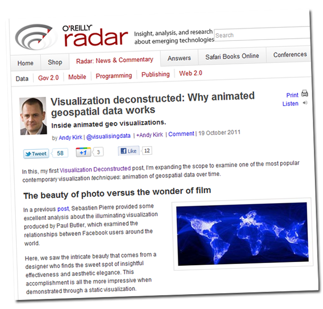
The first of these articles was published today, focusing on why animated geospatial data works so well. In this piece I explore some of the most prominent recent demonstrations of this technique and analyse the design choices that lead to their great effect.
Click on the preview image below to read the full article.


