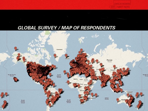
Matt Mullenweg, founding developer of WordPress, published details of his 2011 ‘State of the Word’, an annual overview of the headlines, success stories, facts and figures relating to the utilisation of the opensource web/blog tool. Part of this narrative was based on results from the first ever WordPress user and developer survey, which got over 18,000 responses from all over the world, as mapped below:
There is a goldmine of potential insights contained within the survey data: juicy bait that Matt dangles to visualisation designers out there…
We know there’s more good stuff hidden in there and we’re open sourcing and releasing the raw information behind it. If you’re a researcher and would like to dig into the anonymized survey data yourself, you can grab it here. (Careful, it’s a 9MB CSV.)
So, anyone got time and/or interest to give it a go? I’m not launching a contest, no prizes, but if anyone does come up with some interesting visualisation designs let me know and I’ll stick them up on the site and, of course, share them back with the WordPress crew themselves.
Incidentally, here is the full video of Matt’s address:

