The popularity of the data visualisation field continues at a real pace, with outstandingly innovative designs penetrating hitherto uncharted mainstream territories and thoughtful writing providing a binding narrative backdrop. Of course there continues to be many unanswered questions and challenging issues, not least in the form of the myriad examples of weak, misguided practice.
However, its the positives that I’m focusing on and I’d like to mark the half-way point of 2011 with a collection of the 10 most prominent, memorable, significant, progressive and (personally) appealing developments of the year so far.
There may be some surprising selections here, in some people’s eyes, but there’s good reason behind my inclusion of each one – they all contribute directly or indirectly, intentionally or otherwise, to furthering the progress of the field.
And so, in chronological order…
1. Mike Bostock’s D3
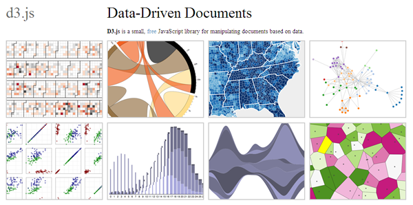
A great evolution in the development of visualisation programming tools, D3 is “is a small, free JavaScript library for manipulating documents based on data“. Created by Mike Bostock, it is a successor to the popular Protovis and provides a fast, flexible and efficient visualisation framework for designing contemporary web-based visualisations.
2. Stephen Von Worley’s Data Pointed – US Population Growth Rings
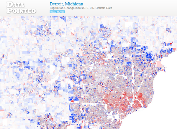
If you haven’t seen these density maps showing the population growth (blue) and decline (red) across the US between 2000 and 2010 then you must check them out. Elegant, beautifully executed designs which provide real insight into the shifting population patterns of US cities, towns and suburbs.
3. LIVE Singapore
LIVE Singapore! is a really exciting project from the SENSEable City Lab and part of the Future Urban Mobility research initiative at the Singapore and MIT Alliance for Research and Technology. Researchers have collaborated on the development of an open platform for collating and publishing a range of innovative, real-time data visualisations about the city. So far there is a portfolio of six great visualisations which investigate different areas of interest and relevance to the city of Singapore.
4. Pete Warden’s iPhone tracker
![]()
I included this project by Pete Warden because it represented such a (relatively) simple, fast and effective way of exploiting the then revelation that iPhones were storing location coordinates and timestamps of owner’s movements. Rather than view this situation solely as a data privacy issue, the visualisation community typically saw it as a great opportunity to explore interesting patterns of their own geographical movements.
5. Flowing Data discussion – Business Intelligence vs. Infotainment
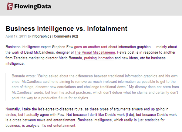
Over the past couple of months the blogosphere (hate myself for using that phrase!) agenda has been dominated by the relentless zeal of Stephen Few to challenge perceived bad practice, with David McCandless the apparent target of his ire. There has been a great deal of debate, disagreement and reaction to his series of posts, articles and discussions, with this exchange on Nathan’s FlowingData site being the highlight. Watch this space, though, because this will rumble on and on…
6. New York Times – Death of a Terrorist
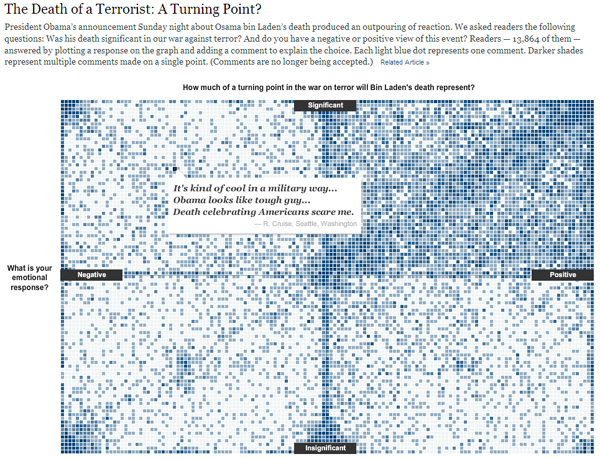
Probably not a piece most would select, but I loved this interactive visualisation on the New York Times. It enabled readers to submit and classify their reaction to the death of Osama Bin Laden, based on a two-by-two matrix which plotted the polarity of emotional response with the perception of the event’s significance. This was such an intelligent way of deriving maximum value from what would have otherwise being a relentless stream of text based comments. Whilst it reveals patterns of perception it also reveals behavioural patterns in how we classify opinion, with the outer edges and diagonals noticeably hosting most of the reaction.
7. Call for higher standards in Infographics
At the same time as the Stephen Few debates were occurring, the visual journalism field was having its own high profile exchanges about the principles and practices of infographic design. It appeared that the breaking news of Osama Bin Laden’s death, and the accompanying infographic coverage (like the piece above) had pushed the effectiveness and discipline of infographic design into the spotlight. The Nieman Watchdog site published an article by Juan Antonio Giner (President of the Innovation International Media Consulting Group) and Alberto Cairo (Director of Infographics at Época) who proposed 6 key rules to protect the legitimacy and quality of infographic/visual journalism practice. This was met by a hugely favourable reaction and an impressive list of names and endorsements were quickly attached to this proposal. Another development to keep a close eye on.
8. OECD Better Life Index
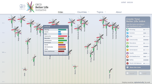
This work would probably have made it on most peoples’ top ten list. A superb visual design and interactive solution, created by Moritz Stefaner, Jonas Leist and Timm Kekeritz, which enables people to explore the quality of life across the 34 member countries of the OECD based on 11 different customisable indicators. It has caught the imagination of the public with excellent visitor and usage levels, but it is no surprise as it perfectly achieves the critical balance between aesthetic beauty, intuitive engagement and accessible insights.
9. Data Without Borders

A recent launch that will develop more over the second 6 months of 2011, this is nevertheless an entirely worthy candidate for this top 10 list. Initiated by Jake Porway of the New York Times’ Research & Development team, Data Without Borders aims to establish a ‘data scientist exchange’, connecting the expert community of visualisation and analytical practitioners with non-profit and NGO organisations. It has received much positive coverage so far, building some great early momentum, which will hopefully translate into a successful implementation in the not-too-distant future.
10. Eyeo Festival
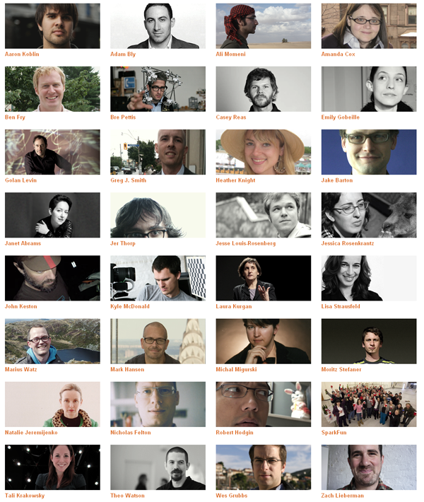
I wasn’t there, and neither were many. In fact I’m a bit grumpy and pained by this state of affairs. So why would I include it? Because it sounded immense. Those local souls who were in attendance seemed to rave about it with so much positive sentiment that I’ve rarely seen for any conference event of this nature. Those of us looking in from the outside were provided with a teasing glimpse of Eyeo’s leg through the prolific Twitter feeds that enlightened us with quotes, photos and live commentaries of some of the fantastic creative personalities and exhibitions taking place. You can read one of the many great accounts of the event here: day 1, day 2 and day 3. Hopefully there will be an Eyeo II in 2012…
Special mentions…
Having struggled to keep this list down to only 10 (a list of ten items does make for a much more satisfactory headline!), here is the sub’s bench of special mentions who just missed out on a top 10 position:
Good Magazine – Are the richest Americans also the best educated? – This generated a huge amount of healthy, challenging, theory-based verbal energy about design theory and principles. Like some of the above listed milestones, only good can come out of these exchanges.
Visualising the seasons in Norway – Steven Kay’s beautful photo-visualisation collage of 365 individual images taken of the same garden scene throughout the year, revealing the seasonal patterns in nature, light and weather.
Food Consumed – Lauren Manning’s thesis project which explores multiple visualisation methods applied to one single data set. As of today this is still an ongoing project and it will be fascinating to see the results and conclusions.

