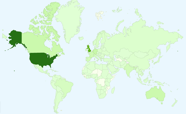
One of the most interesting and inspiring consequences of running a website and writing a blog comes when you explore the geographical spread of visitors who view your content. At the last count, people from 177 different countries have visited my site since its inception at the start of last year.

My global ignorance
Of course, within this spread of visitors is a strong pattern of distribution and it is no surprise that the largest quantity of visitors come from English speaking regions, particularly the UK, USA, Australia and Canada.
As somebody only capable of consuming blog feeds, tweets and web content from English speaking authors, this dominant pattern of visitors is consistent with my relatively narrow exposure to ‘western’ visualisation practices. However, I am keenly aware from my several years in this field (especially through my World Cup visualisations series) that there are wonderfully creative developments popping up all over the world.
My recent attendance at Visualizing Europe exposed me to many inspirational designers, speakers and thought-leaders from all across the continent. I decided that I wanted to do something active to address the significant gap in my awareness of the progress of visualisation around the world. I’m sure I’m not the only one too.
Visualisation around the world
To find a solution to this I am kicking off a new series of articles, ingeniously titled ‘Visualisation around the world’.
I am offering an open invite to any designers, authors, academics, bloggers, analysts or just simply residents, from as many different countries as possible, to illuminate the rest of us with your observations about the visualisation scene in your country or region.
You will have the platform of this website to share your analysis of the development of visualisation practice in your locality:
- How prevalent is visualisation practice?
- How would you describe the most common styles?
- What are the most prominent contemporary examples?
- How is visualisation being used in the media, in corporate world, in sport, science, government etc.?
- Are there any key gaps or barriers to progress? Cultural, technical, capabilities?
These are just a few suggestions for the potential structure of your articles, they would otherwise be completely open to your own creativity and structure of observations.
List of regions that need reporters like you!
Here is a list of key regions that I compiled from a Google Analytics map to define the groupings of volunteer authors/representatives I would love to hear from:
- UK & Ireland
- USA
- Canada
- Central America
- South America
- Northern Europe
- Western Europe
- Eastern Europe
- Western Asia
- Southern & Central Asia
- Eastern Asia
- South Eastern Asia
- Australasia
This is not to limit the list to just these defined places and if more than one author volunteers for the same place I’ll happily publish multiple perspectives about the same area, or combine into a single piece.
Whether you write about your entire region or represent a more detailed view of your own country, I’m happy either way. To be honest the more detail, the more specific the location and the more author volunteers, the better!
How do I volunteer to represent my country/region?
Very easily. Just drop an email to andy@visualisingdata.com, let me know which country or region you would like to write about and I’ll set you on your way! All you need to do then is get thinking, get gathering and get writing, then send me your article content and I’ll publish it.
I’m positive that across the geographical representation of my frequent visitors, my RSS feed subscribers, my Twitter followers and Facebook friends there are people across the world with a passion for this subject.
So please get in touch and let’s learn more about the world of data visualisation!

