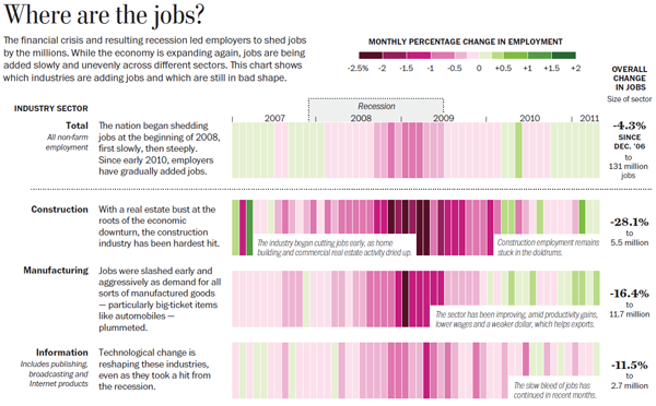
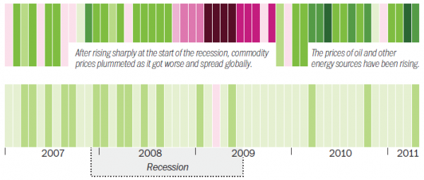
Nice piece of work from the Washington Post graphics team, presenting an effective small multiples/heatmap fusion to demonstrate how the financial crisis has impacted on a range of industries across the US in terms of job numbers.
Each horizontal sections presents the ups and downs of the different industries. Each strip is a month’s increase or decrease in job numbers %. The decreases are encoded using an ever stronger saturation of purple and the increases likewise but in green. As the two shades reach their peak the two darkest levels are a little hard to differentiate but that’s only a minor quibble. The only thing I didn’t care too much for was the useful but rather intrusive narrative which appears over some of the graphics.
This is a static representation of an accompanying interactive map that is published with the main article. The interactive works well enough but there is something much more elegant and satisfying about a single static graphic that manages to capture the essence of a complex story and communicate it really well.
Nice work from Kat Downs, Neil Irwin and Alicia Parlapiano.


