Google have announced the winners, runners-up and notable mentions for their recent ‘Visualize Your Taxes‘ challenge which invited designers to create data visualisations that would make it easier for US citizens to understand how the government spends their tax money.

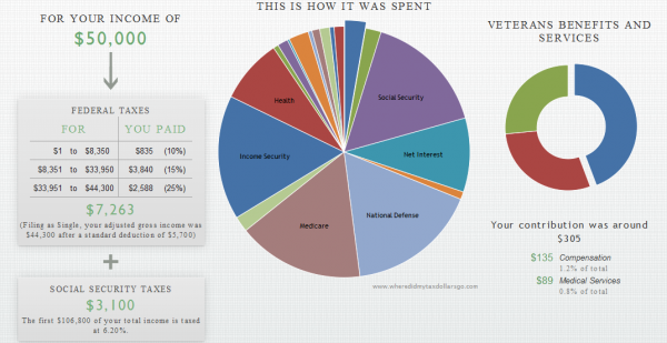
The winner is a project titled ‘Where did my tax dollars go?‘ by developer Anil Kandangath. It is driven by a simple scenario entered by the user who are invited to input annual earnings and select how they filed. It then generates an interactive visualisation to explore how the taxes were used from these earnings.

The interface is nicely designed, the concepts are accessibly communicated and there is a certain pleasure from the interactivity but the principal visualisation component is a multi-segment pie chart and an accompanying donut chart which greatly undermines the effectiveness of this design.
In a week when there has been a refreshingly sensible, pragmatic and helpful discussion about the merits of the pie chart (Eager Eyes article), the deployment of this chart here simply demonstrates why it’s mis-use attracts so much negativity within the field.
Considering the membership of the judging panel and the nature of the recommended resources, with all due respect to the winner I’d suggest this is a rather disappointing outcome. In my eyes the ineffective use of the pie chart means it ultimately fails to meet the contest aim of ‘making it easier for US citizens to understand how the government spends their tax money’.
Which entry would have received your vote? My favourite so far has been the TaxMapper by John Halloran and Hermann Zschiegner. Check out all the entries.
