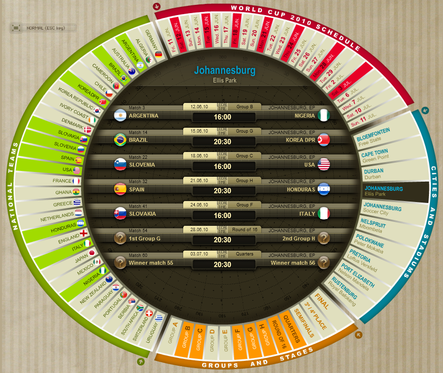
Those of you who followed my South Africa 2010 World Cup posts during last summer (part 1, part 2 and part 3) will possibly remember one interactive visualisation design in particular, a World Cup schedule by Spanish daily Marca.

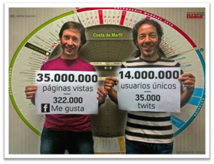
Amongst many different visualisation approaches to bringing the World Cup to readers from the World’s media outlets, this was one of the most shared, discussed, liked and retweeted projects as the figures below (as at July 2010).

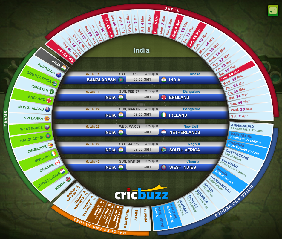
Sharp-eyed reader Sachin Rajpal has pointed me in the direction of a remarkably similar concept for the ICC Cricket World Cup 2011 Schedule on the CricBuzz website and judging by the initial stats is experiencing the same sort of popularity.

Is this a case of the same design team replicating their successful formula on a different media platform or evidence of imitation being “the sincerest form of flattery”?
