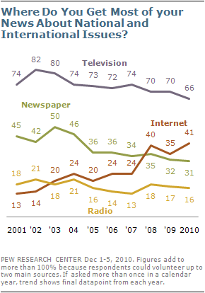
On Flowing Data, Nathan has just posted one of his ‘Visualize This‘ design challenges to apply an improved visualisation treatment to an existing graph.
The graph in question shows the results of poll data from the Pew Research Center, suggesting that the Internet has gained on Television as the public’s primary news source in 2010.
As Nathan observes, this isn’t the worst graph in the world but it is very busy (caused by the excessive labelling).
I’ve quickly crafted up a simple alternative which separates out the data series into small multiples of area charts thus enabling straightforward comparison across each data set. I’ve maintained the same colour scheme but this could be exchanged for a single, consistent colour for all charts so that no single hue dominates disproportionately. The only labels shown are those for the latest year of data.
(click on image for larger view)
Depending on the layout constraints associated with publishing the original graph, the current label sizes and overall dimension may not be ideal but, anyway, this is just a suggested alternative approach.
Incidentally, I think the headline insight from the results is two fold – the fact that Internet is eating into Television’s source of news share (the other two are fairly flat) and that Internet continues to pull away from Newspaper.


