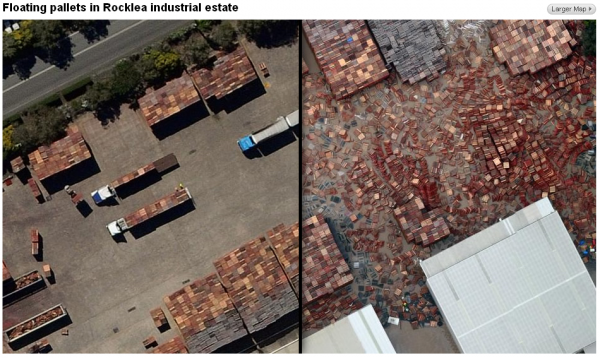
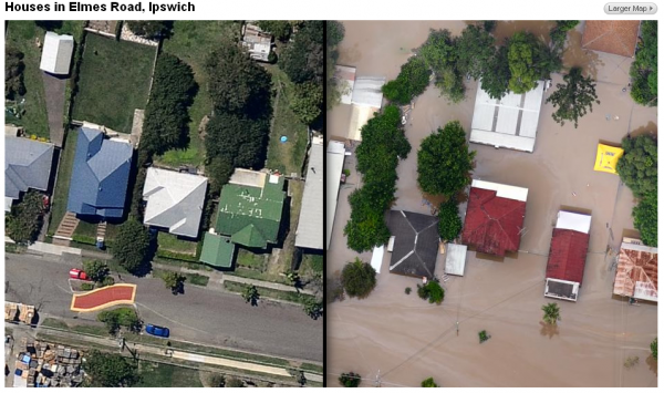
Not strictly a piece of data visualisation but I can’t avoid sharing this wonderful demonstration of how visuals combined with slick interactivity can provide an extremely compelling and impactive story.

They come from a pair of presentation packages on the ABC News website (part one and part two) about the recent floods in Brisbane.
High-resolution aerial photos taken over Brisbane last week have revealed the scale of devastation across dozens of suburbs and tens of thousands of homes and businesses.
You can compare the before and after shots by dragging the slider left and right to reveal the devastation.

A highly effective and revealing method of communicating this story, you can’t help but go through and study each one in detail.
